How Top Brands Use Email Marketing (Real Examples and Breakdowns)
The fastest shortcut in email marketing is studying what's working for brands ahead of you. Not copying — studying. Understanding why a welcome sequence is structured a certain way, why a subject line formula keeps recurring, why some brands use minimal design while others go image-heavy. That pattern recognition is what separates marketers who constantly improve from those who keep guessing.
This post breaks down the email strategy patterns used by top-performing brands across five categories — with the reasoning behind each decision so you can adapt, not just imitate.
Why Studying Real Brand Emails Works
Before the breakdown: why look at real examples rather than hypotheticals?
- They're battle-tested. Real brand emails sent to real audiences have been tested, refined, and in many cases A/B tested across hundreds of thousands of recipients. The patterns that persist are there because they work.
- They show the full picture. Individual tips ("use a strong CTA") are easy. Seeing how a brand structures an entire email from subject line to footer shows how the elements work together.
- They calibrate your expectations. Seeing that a highly effective brand uses a plain-text email with minimal imagery challenges the assumption that email has to be visually elaborate to perform.
- They reveal category-specific norms. What works in e-commerce email is different from what works in B2B SaaS or newsletter media. Real examples show these distinctions in action.
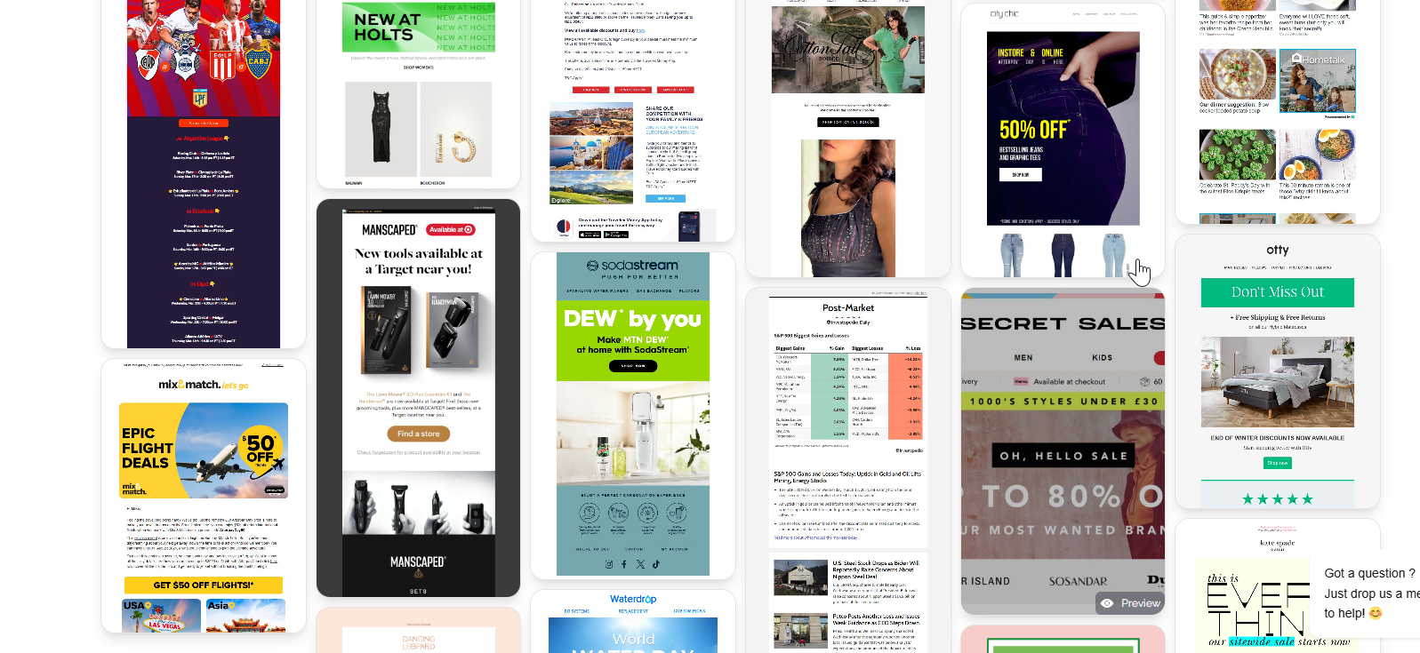
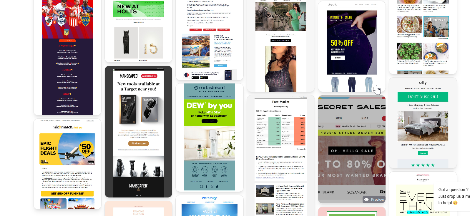
MailGlider is built specifically for this kind of research — a curated library of real emails from hundreds of brands, organized by type and industry, so you can browse what's working before you build your own campaigns.
Pattern 1: The "Plain Text" SaaS Onboarding
Who does it: Most successful SaaS products — Notion, Linear, Figma, Superhuman, Basecamp, and many others use this approach.
What it looks like:
- Almost entirely plain text (or very minimal HTML — just a logo at top)
- Sent from a founder or team member's name, not "The Company Team"
- Very short — often under 100 words
- One specific, actionable CTA
- Conversational, first-person voice
Why it works:
- Looks like a personal email, not a blast → higher open rates
- Loads instantly on any device or connection
- The simplicity signals confidence ("we don't need flashy design — the product sells itself")
- Personalized sender name increases the sense of direct communication
The lesson: For SaaS onboarding and early-lifecycle emails, less design is often more effective. The email's job is to get the user to take one action — elaborate design distracts from that.
Pattern 2: The Flagship Newsletter Format
Who does it: Morning Brew, The Hustle, The Skimm, 1440, Axios, Lenny's Newsletter.
What it looks like:
- Highly consistent format, issue-after-issue (the template never changes)
- Scannable sections: headline → brief summary → link → repeat
- Distinct brand voice and personality
- Mix of original reporting/commentary + curated links
- Heavy use of formatting (bold, headers, dividers) to enable skimming
- A recurring element that readers look for ("Charts of the Day," "The Loop," "Stat of the Week")
Why it works:
- Consistency builds habit — readers know exactly what they're getting and where to find it
- Scannable format respects reader time → better engagement metrics
- Unique voice creates identity → readers feel like they're reading something, not just receiving marketing
- Recurring elements create anticipation → readers open specifically for that section
The lesson: For newsletter operators, format consistency is more important than creative novelty. Change the content; never change the container. Readers' habits form around predictability.
Pattern 3: The E-Commerce Promotional Email
Who does it: Allbirds, Glossier, Warby Parker, Away, and most DTC brands.
What it looks like:
- Hero image dominating the top third of the email
- Minimal copy — often 1–3 sentences maximum above the CTA
- Product-forward — the image carries most of the persuasion work
- Single, high-contrast CTA button
- Optional: one additional product section below ("Also new this week")
- Clean, white-space-forward design with on-brand color palette
Why it works:
- Product beauty is the product's best marketing tool — let the imagery sell
- Mobile-optimized single column renders perfectly on phone
- Short copy reduces friction between impulse and click
- Consistent design builds visual brand recognition (subscribers recognize the email before reading a word)
The lesson: In e-commerce, design carries more weight than copy. Invest in product photography and keep copy minimal. The email's job is to surface the product — the product's job is to close the sale.
Pattern 4: The "Educational + Soft Sell" B2B Email
Who does it: HubSpot, Salesforce, Intercom, Notion, Ahrefs, and most content-driven B2B companies.
What it looks like:
- Opens with a useful insight, statistic, or concept — no immediate pitch
- 300–600 words of genuinely helpful content
- Product connection is subtle — woven in as an example or mentioned at the end
- Multiple internal links (to blog posts, guides, or product features) rather than a single CTA
- Clean HTML with minimal imagery — often text + one graphic
- Weekly or bi-weekly cadence
Why it works:
- Educating the audience first builds trust and authority
- Readers open future emails expecting value, not promotions
- Multiple links serve different reader intents — some click for content, some for product
- The long game: subscribers who read consistent educational content have dramatically higher LTV than promotional-email-only subscribers
The lesson: B2B email that provides genuine education doesn't just drive immediate conversions. It builds a relationship with a category of buyer over months and years — and those buyers become the most loyal customers.
Pattern 5: The Re-Engagement Win-Back Email
Who does it: Almost every brand that manages their list seriously — Spotify, Netflix, DTC brands, SaaS companies.
What it looks like:
- Subject line that directly acknowledges absence ("We've missed you," "It's been a while")
- Short, personal copy — doesn't try to sell everything at once
- Often one piece of relevant new content or an exclusive offer
- A final "stay or go" email in the sequence with an unusually direct subject line ("Should we break up?")
- Unsubscribe is made easy (counter-intuitively, this improves response — people appreciate the honesty)
Why it works:
- Directly acknowledging the gap is disarming — it doesn't pretend the absence didn't happen
- The "break-up" email generates outsized response because it forces a decision in a way most emails don't
- The honesty and directness of the sequence often reignites interest in subscribers who had forgotten why they signed up
- List cleanup after the sequence improves deliverability and engagement metrics for the remaining active list
The lesson: Subscribers who aren't engaging aren't gone forever — but they won't re-engage without a reason. Give them one, make it worth their time, and let those who don't re-engage go gracefully.
Cross-Brand Patterns Worth Noting
After studying hundreds of high-performing brand emails, several patterns appear across categories:
1. The single-CTA rule is near-universal among top performers.
The brands that consistently get high click rates use one primary CTA per email. Multiple CTAs split attention and reduce overall click rate.
2. Consistent sender name outperforms rotating senders.
Brands that consistently send from the same person or name get better deliverability signals (people recognize and whitelist the sender) and higher open rates.
3. The best subject lines are specific, not clever.
Across e-commerce, B2B, newsletters, and SaaS: specific, honest subject lines ("Your order is on its way," "3 things to try this week," "We just shipped [Feature]") consistently outperform clever or mysterious ones.
4. Plain text works in more contexts than people assume.
The best-performing onboarding emails, re-engagement emails, and executive communications are often plain text. Design is not always an advantage.
5. Brands that invest in list quality outperform on every metric.
Consistently, brands with smaller but more engaged lists outperform large, disengaged lists on CTR, conversion rate, and revenue per email. List hygiene is as important as campaign creativity.
Frequently Asked Questions
How do I find real examples of brand email marketing?
MailGlider maintains a curated library of real emails from hundreds of brands, organized by company, category, and campaign type. Other resources: Really Good Emails, Milled.com, Email Love, and signing up for the email lists of brands you admire.
Why do some top brands use plain text emails?
Plain text emails often perform better than designed HTML emails in contexts where personal connection matters more than visual impressiveness — SaaS onboarding, sales follow-ups, executive communications, re-engagement campaigns. They look like personal emails, which increases engagement.
What makes a brand's email marketing "great"?
Consistent delivery of relevant value, a recognizable voice and format, clear single CTAs, list management that keeps engagement high, and a measurable connection to business outcomes (conversions, retention, revenue). Great email marketing is less about individual campaigns and more about a coherent program built on audience understanding.
How do I develop my brand's email voice?
Study 10–15 emails from brands in adjacent categories whose voice you admire. Write down the words that describe what their emails feel like (confident, warm, direct, playful, expert). Write an email in that style, then edit until it sounds like your brand — not theirs. Voice develops through practice and feedback.
How often do top brands send marketing emails?
It varies dramatically by category: daily for major media newsletters, 2–4x/week for active DTC brands, weekly or bi-weekly for most B2B and SaaS companies. The unifying factor: whatever their frequency, top brands are consistent about it.
Conclusion
The best email education is real email. Study what top brands actually send — not just the design, but the structure, the copy decisions, the cadence, the subject line formulas, and the segmentation logic underlying the campaigns.
MailGlider is built to make this research as easy as possible. Browse the library — organized by brand, campaign type, and industry — and start building a personal reference file of the emails and patterns that you want to bring into your own program.