You don’t need to be a designer to build great-looking emails. You just need the right playbook.
Design has a direct impact on performance—emails that look clean, professional, and easy to read convert more. Here’s how to design emails that perform, without touching a line of code.
1. Start With a Clear Visual Goal
Before you design, ask: What’s the one action I want readers to take?
Design every section of your email to support that goal. From image placement to CTA contrast, every element should move the reader closer to that click.
Use MailGlider’s “Goal-Based Layouts” to shortcut this planning process.
2. Stick to a Single Column
Multicolumn emails often break on mobile and introduce friction.
Benefits of single-column design:
- Mobile responsiveness
- Cleaner visual hierarchy
- More predictable performance
MailGlider offers mobile-first templates built with single-column best practices in mind.
3. Use White Space Generously
White space isn’t wasted space—it’s how you create clarity.
Tips:
- Space out paragraphs and sections
- Add breathing room around buttons
- Let images stand alone without crowding
MailGlider’s builder includes spacing controls so you can fine-tune padding and margins visually.
4. Choose Web-Safe Fonts and Consistent Sizes
Avoid using too many font types or styles. Stick to one primary font, with consistent hierarchy:
- Heading: 24–32px
- Subhead: 18–20px
- Body: 14–16px
MailGlider templates follow these typographic rules by default, ensuring consistency without effort.
5. Use High-Contrast CTA Buttons
Your CTA should be:
- Visually distinct from the background
- Large enough to tap on mobile
- Surrounded by empty space
MailGlider’s pre-styled CTA buttons come with tested color schemes and hover states to drive interaction.
6. Test in Light and Dark Mode
Over 35% of users read email in dark mode. If your design only works in light mode, you’re alienating a large audience.
Use MailGlider’s built-in dark mode preview and adjustments to ensure your text and CTA stay legible.
Final Thoughts
Effective design isn't about creativity alone—it’s about clarity, consistency, and conversion.
MailGlider lets you skip the blank canvas and start with beautiful, functional layouts that are proven to perform.
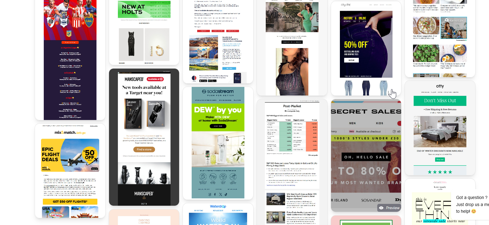
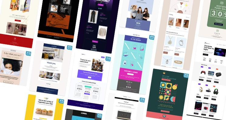
Explore the full library of responsive, designer-built templates at MailGlider Templates.