Design isn’t just about looking good—it’s about guiding attention and driving action.
Whether you're building a newsletter or promotional campaign, these design principles will help you craft emails that convert in 2025.
1. **Use a Visual Hierarchy**
People skim emails. Use bold headlines, clear subheads, and scannable bullets to structure your message.
🔍 Tip: Follow the Z-pattern or F-pattern layout for better readability.
2. **Keep It Mobile-First**
Over 60% of emails are opened on phones. Design responsively with touch-friendly buttons, readable fonts, and single-column layouts.
3. **Limit Your CTA Choices**
Don’t overwhelm. One email = one goal.
Use a single, strong CTA (Call to Action) and repeat it subtly throughout the email if needed.
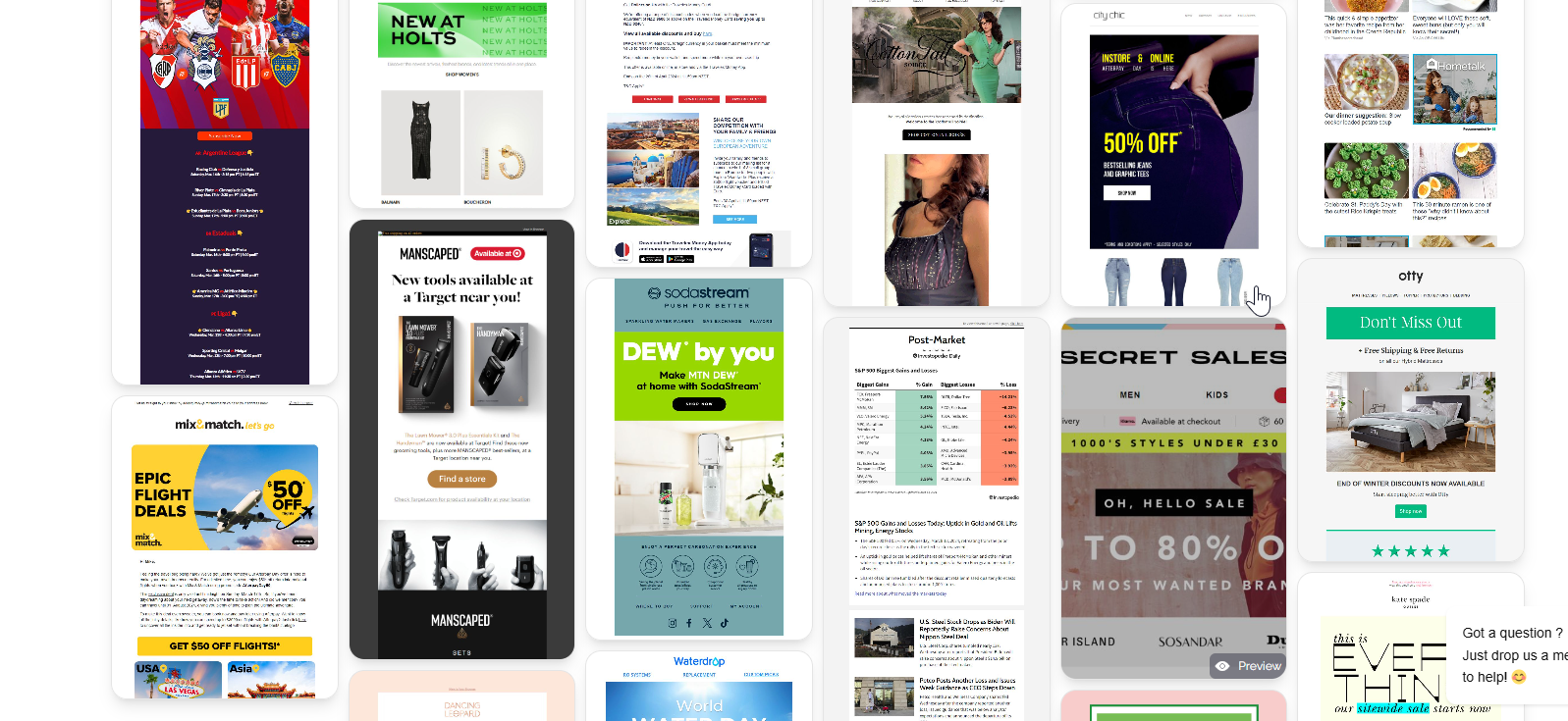
4. **Use High-Quality Visuals**
Stock photos are out. Use custom graphics, product GIFs, or minimal illustrations that align with your brand identity.
🎨 MailGlider Pro users get access to 5,000+ premium design blocks.
5. **Whitespace is Your Friend**
Don’t cram everything into one screen. Let your content breathe. Whitespace = elegance + readability.
6. **Brand It, But Don't Overdo It**
Use brand colors, fonts, and logos—yes—but make sure they support the content, not overpower it.
7. **Dark Mode Compatibility**
Design with dark mode in mind: test contrast, background images, and fallback colors to ensure your emails look great in all inboxes.
8. **Test on Real Devices**
Previews are nice, but rendering bugs are real. Use tools like MailGlider's Email Preview Lab to check how your email looks across Outlook, Gmail, Apple Mail, and mobile devices.
Bonus: Template Structure That Converts
Here's a battle-tested layout: