Investopedia is partnering with CMT Association on this newsletter. The contents of this newsletter are for informational and educational purposes only, however, and do not constitute investing advice. The guest authors, which may sell research to investors, and may trade or hold positions in securities mentioned herein do not represent the views of CMT Association or Investopedia. Please consult a financial advisor for investment recommendations and services. |
|
|
The Presidential Cycle is a four-year cycle where the US Stock Market seems to make similar returns in each of the four years. I.e. We compare all the years of the election (2020, 2016, 2012…) and the results seem to align. The most common theory behind the cycle is that there is more spending in years leading up to a Presidential Election and that leads to Stock Market gains. Another reason is that fund managers tend to take a “wait and see” approach when there is a change in administration, so the buying pressure is lower. Regardless, there is a general pattern that we can take advantage of if we dig in and have a look at what history has to tell us. |
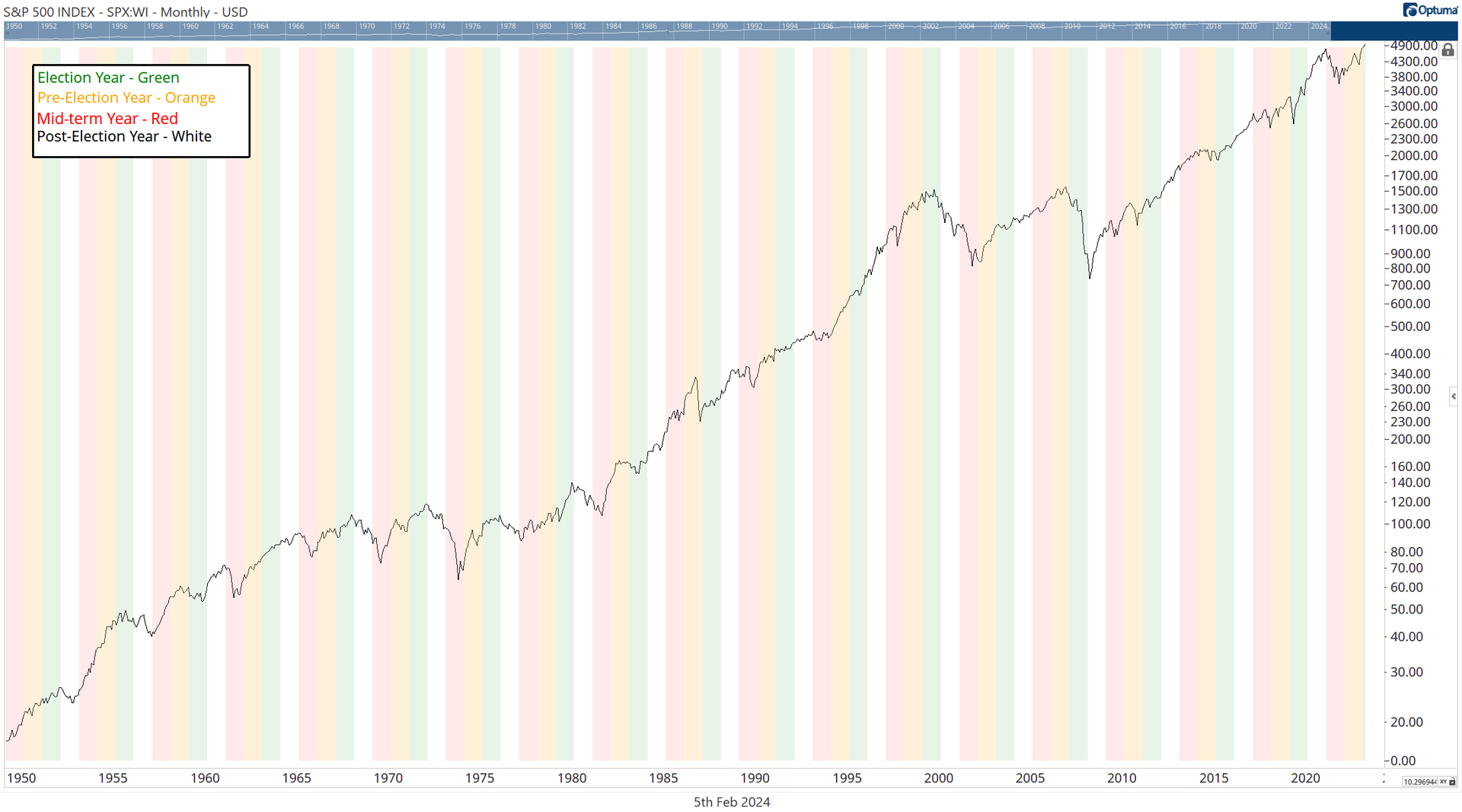
In Chart 1, we can see the past 70 years of the S&P 500. On the chart I have highlighted each of the cycle years. This is a great visual, but there is not much we can do with this on its own. Instead, we can do a small quantitative analysis to determine the average returns for each of these years and also the Probability that the year will end up (positive). Let’s look at the four years in the cycle: Year 1: Post-Election Year Average Return is 4.7% Probability of a Positive Year is 56% Year 2: Mid-Term Year Average Return is 2.3% Probability of a Positive Year is 65% Year 3: The Pre-Election Year. Average Return is 11% Probability of a Positive Year is 88% Year 4: Election year (we are here now!) Average Return is 7.4% Probability of a Positive Year is 83% |
|
|
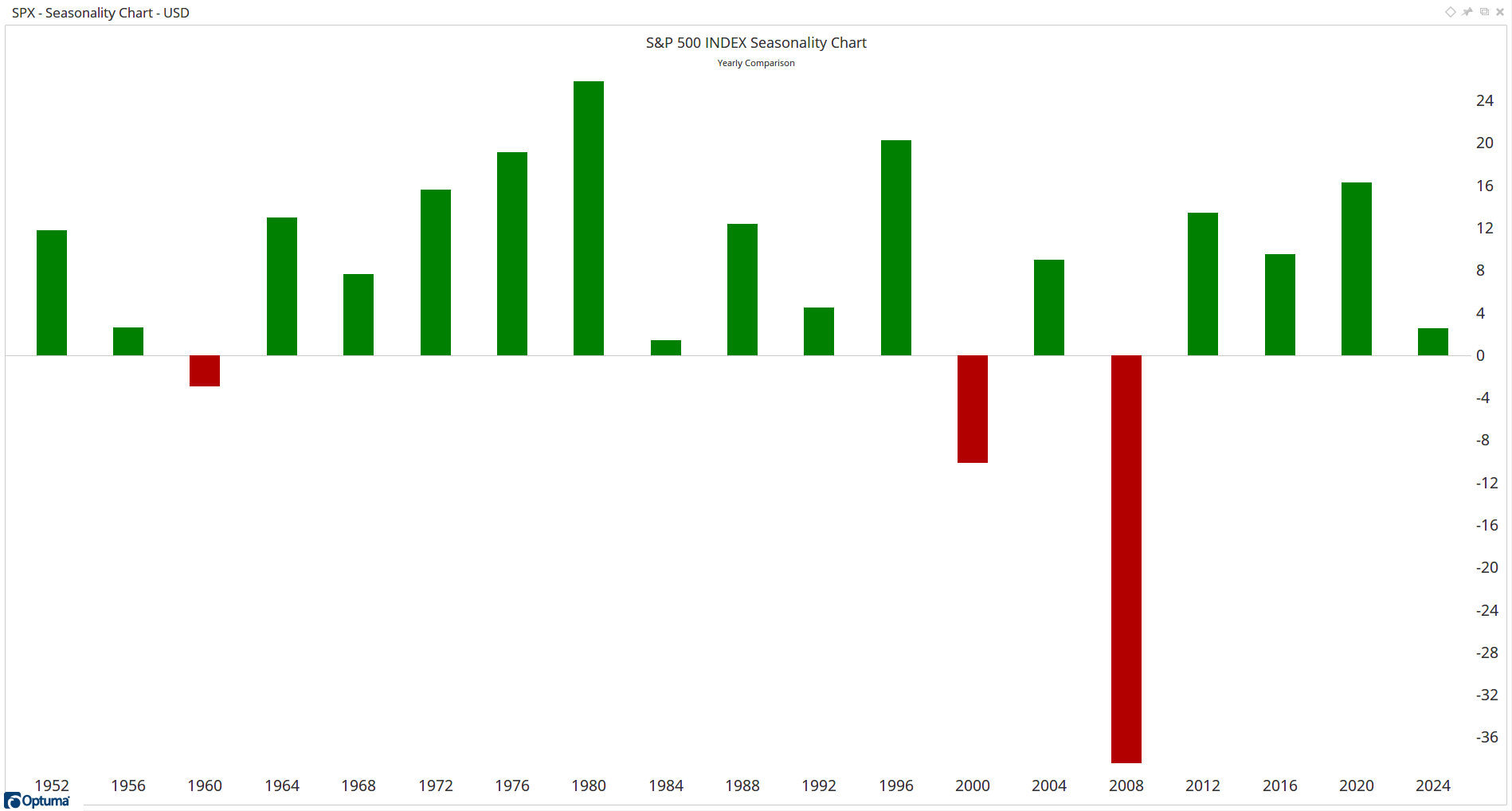
It’s always good to look inside the numbers and view what made up the average. In Chart 2, we look at all the Election years on a Seasonality Chart and we can see how the majority of Election years end with the SPX higher. |
What jumps straight out is that there have only been three bad Election Years in the past 70 years. What is also interesting is those three elections saw a change in which party won the White House: 1960 : Kennedy defeated Nixon 2000 : Bush defeated Gore 2008 : Obama defeated McCain So there are two conclusions: - Parties continue spending in the Election Year and the Stock Market benefits from that.
- If the Stock Market does not rise, a change in the White House is highly likely.
Of course, there are many caveats with any conclusions like this. As Technical Analysts we do not observe something and assume that it is an immutable fact. Rather we see it, take note, and consider it in light of our other analysis. |
|
|
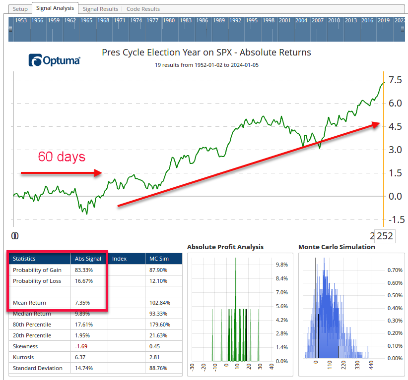
One way that we can dig in further is to examine the average path taken during all the Election Years. Chart 3 shows an Optuma Signal Test result. The main plot is the average of each of the Election Years from the start of the year to the last trading day (252 trading days in a year). |
The average behavior is for the market to be sideways for the first 60 days and then start making gains until the Election is getting close. There is uncertainty about who will win and most large investors are minimizing exposure to potential volatility around the election day. In the final 60 days, after the election until the end of the year, the certainty of what is coming gives investors the confidence to jump back into the market and we usually see a final rally into Christmas. |
|
|
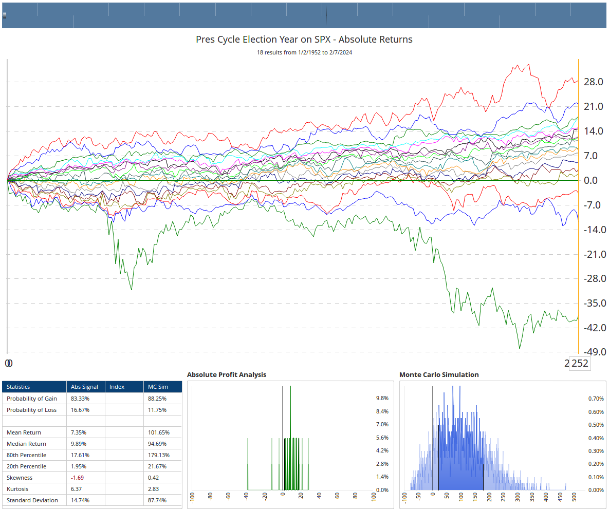
So far this year, the S&P 500 is up 4.6%. That’s considerably more than the average flat 60 days that we saw in Chart 3. So what can we expect from here? To get an idea, we can have a look at the Individual Component Years in Chart 4. It’s just a different version of Chart 3 but instead of showing the combined average, we are seeing each of the years that made up the average. |
|
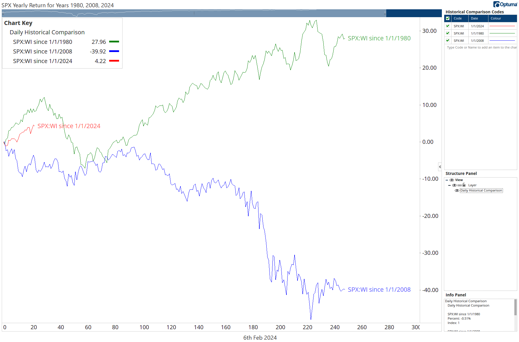
| What jumps out is that those years that started well finished well. Look at the Red line in Chart 4 (1980), it was at 8.8% by this same time in the year and it finished at 28% gain. In Contrast, 2008 started down -3.5% and finished the year nearly 40% down. I’ve repeated those two years with 2024 in Chart 5. Again, while there are no guarantees in financial analysis — we deal in probabilities based on past observations — based on the historical results, the signs are good for 2024 to finish the year strongly. |
|
|
Mathew Verdouw, CMT, CFTe is an Australian Computer Systems Engineer who fell in love with the Markets and the journey to discover why they behave the way they do. He divides his time between learning about the markets, working with clients who include some of the largest funds in the world, and creating software to help his clients gain better access to Technical and Quantitative tools. |
|
|
You are receiving this newsletter because you subscribed to the Chart Advisor newsletter. If you wish to unsubscribe, please click here. Dotdash Meredith 225 Liberty St, 4th Floor, New York, NY 10281
© 2024 All Rights Reserved. Privacy Policy | Terms of Service |
|
|
|