By David Cox, CMT, CFA, FCSI, FMA and Conor White CMT, CIM
|
|
|
Investopedia is partnering with CMT Association on this newsletter. The contents of this newsletter are for informational and educational purposes only, however, and do not constitute investing advice. The guest authors, which may sell research to investors, and may trade or hold positions in securities mentioned herein do not represent the views of CMT Association or Investopedia. Please consult a financial advisor for investment recommendations and services. |
|
|
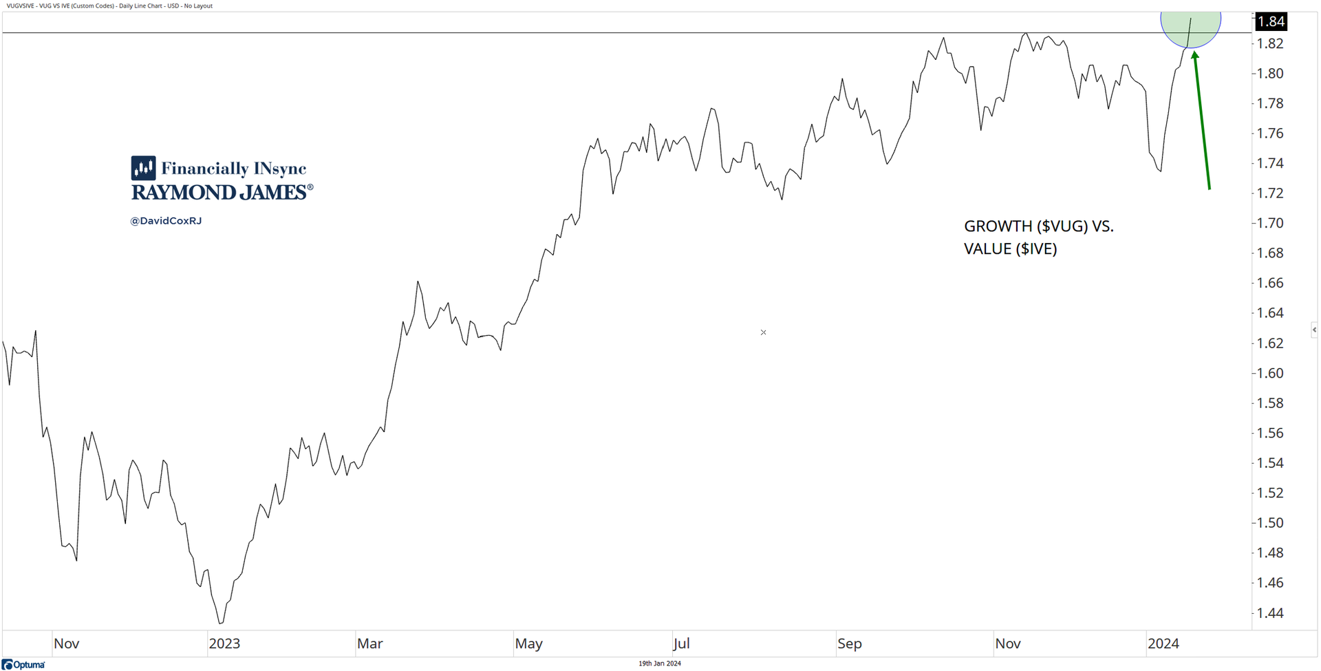
Growth stocks broke out yesterday, making highs on a both an absolute basis (ahead of the market) and relative basis against value stocks. This is supportive of the bullish case for markets and continues to evidence the underlying demand for stocks. Relative strength, which is the comparison of one asset against another, is useful in making allocation, sector and stock decisions and helps investors always be willing to contemplate a potentially stronger choice for their portfolio. This can mean stocks vs. bonds, technology vs. S&P 500, or in this case, growth stocks vs. value stocks. |
|
|
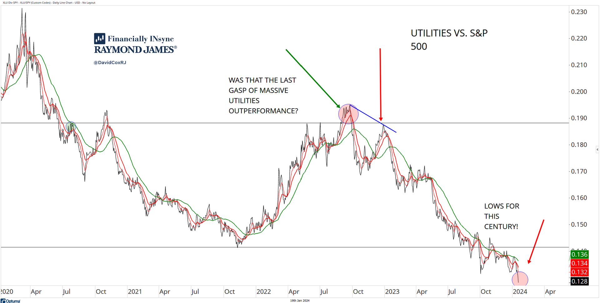
Here’s another example of how relative strength can help us stay on the right side of a given trend. In this case, the utility ($XLU) stocks are (and have been) weak, and just made multi-decade lows against the S&P 500, which means to say they are underperforming, and continuing to underperform. So, the more utility stocks that have been held by an investor, the greater the degree of underperformance against a benchmark like the S&P 500. Trends are trends, and as investors, we can observe them and use them to position and allocate our assets appropriately. |
|
|
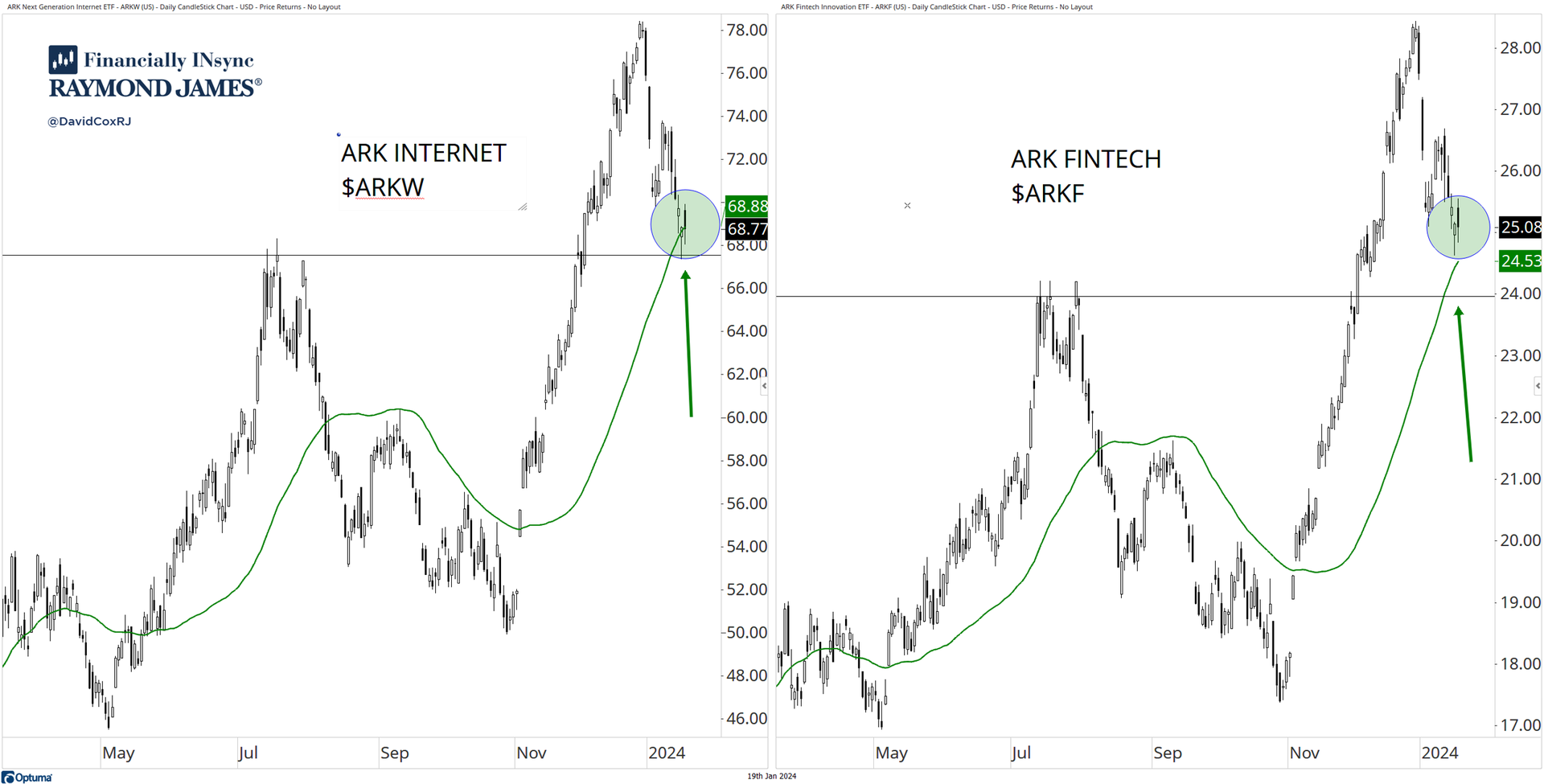
The most simple definition of an uptrend, without introducing fancy jargon or indicators, is higher highs and higher lows. Like many technicians, I do use a moving average or two, which can help us smooth out the noise and keep us focused on the bigger picture, especially when using a higher frequency chart like the two daily charts below. The 50-day moving average (green) is a simple average of the last 50-days of price activity. Many will talk about crossovers of moving averages (me included!) but I do tend to prefer using the slope of the average itself. Is the moving average rising? Is it falling? If stocks, or in the case, the ARK Internet ($ARKW) and ARK Fintech ($ARKF) ETFs are both above a rising 50-day moving average, I see uptrends. I also see (green circles) that have both recently pulled back to that 50-day moving average, which happens to also be above the last summer ’23 highs, which I like to see. At this juncture, with many areas experiencing pullbacks, spotting the pullbacks that remain above prior levels, and above rising moving averages are preferred in my view. |
|
|
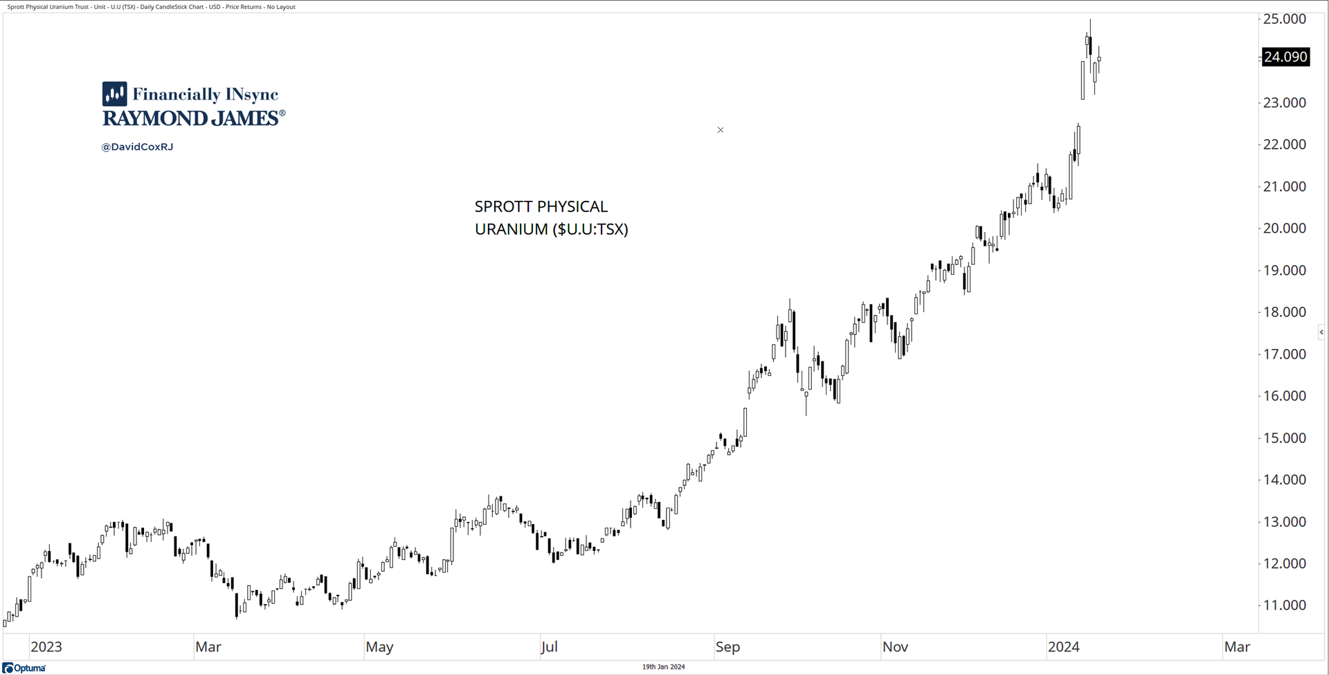
There are lots of investors that will shy away from using simple tools like charts to help guide their decision-making. But charts can empower us to spot, identify and invest in uptrends (and get out of downtrends). Even for a complete novice to technical analysis, let’s conduct a simple “back of the room test”. Looking at the chart below (from the back of your room), I’ll bet you find no doubt that the price of physical uranium is in an uptrend. If you have to squint to figure out if the chart is going up, it’s probably not. If you’re new to chart reading, use the back of the room test. Plot the charts of your holdings and gain new perspectives. I always like to point out, that if you want your portfolio to rise, you’d might as well own stocks and securities that are rising. |
|
|
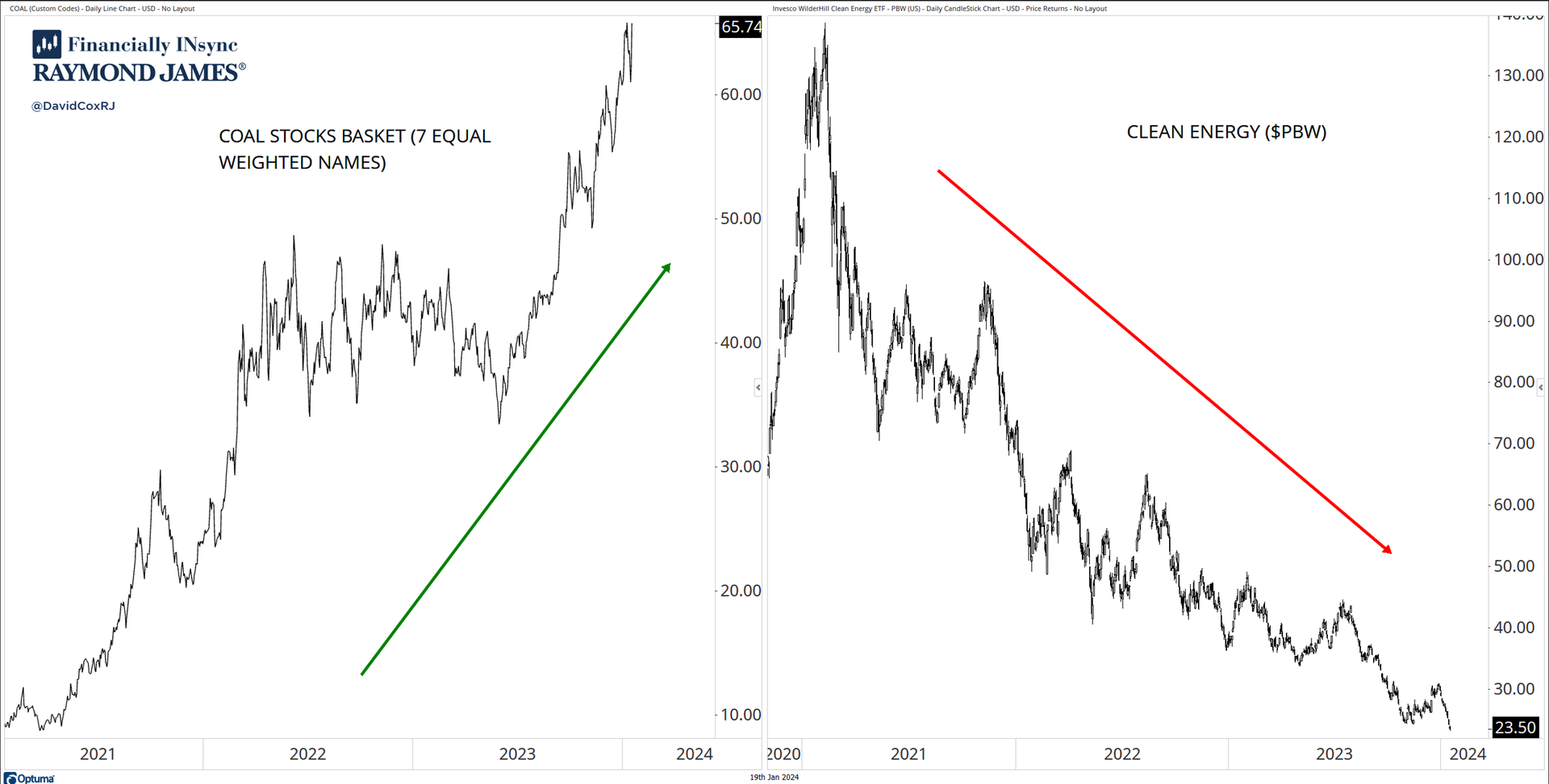
Many investors will embrace a narrative in effort to make sense of their investment strategy. A narrative can help one feel good and rational about their investment choices and have conviction about their decisions. The problem with narratives is that they can stand in stark contrast to reality on the investment landscape. Here’s a case in point. We’re told by our governments that dirty energy like coal must be eliminated and replaced with clean energy and a lot of people think that sounds reasonable. But what do the charts say? On the left, a basket of 7 coal stocks has been in strong uptrend as investor demand for the shares far overwhelms the supply of willing sellers. In contrast, on the right-side (below), we see the Invesco Clean Energy ($PBW) ETF, which has been in a strong and persistent downtrend over the same time period. I think narratives provide more entertainment value and usefulness and will take what the charts tell me every single time, as an investor. |
|
|
About This Week's Authors |
David Cox, CMT, CFA, FCSI, FMA is a dual holder of both the Chartered Market Technician (CMT) and the Chartered Financial Analyst (CFA) designations and is a Senior Portfolio Manager at “Financially Insync” at Raymond James Ltd., in Waterloo, Canada. He manages assets for Canadian, U.S. and International clients using a fundamentally screened, yet technically driven process and produces a weekly webinar called “Where Do We (Investors) Stand?” each Friday. You can find him on “X” at @DavidCoxRJ as he openly and candidly shares charts and perspectives without bias. |
Conor White, CMT, CIM stated his career in wealth management in August of 2017. He holds both the Chartered Market Technician (CMT) and Chartered Investment Manager (CIM) designations. He graduated from Wilfrid Laurier University's Honours Bachelor of Business Administration (BBA) program in 2015 with a concentration in Finance and Economics. Trade analytics, attribution, security screening, order execution, and technical market research are among his many responsibilities as part of the Financially INsync team. Born and raised in Guelph, his interests include music, travel, art and technology. |
|
|
You are receiving this newsletter because you subscribed to the Chart Advisor newsletter. If you wish to unsubscribe, please click here. Dotdash Meredith 225 Liberty St, 4th Floor, New York, NY 10281
© 2024 All Rights Reserved. Privacy Policy | Terms of Service |
|
|
|