By C. Theodore Hicks II, CFP®, CKA®, CMT®
|
|
|
2/ Why We Manage Actively |
4/ Small Caps Outperforming |
|
|
Investopedia is partnering with CMT Association on this newsletter. The contents of this newsletter are for informational and educational purposes only, however, and do not constitute investing advice. The guest authors, which may sell research to investors, and may trade or hold positions in securities mentioned herein do not represent the views of CMT Association or Investopedia. Please consult a financial advisor for investment recommendations and services. |
|
|
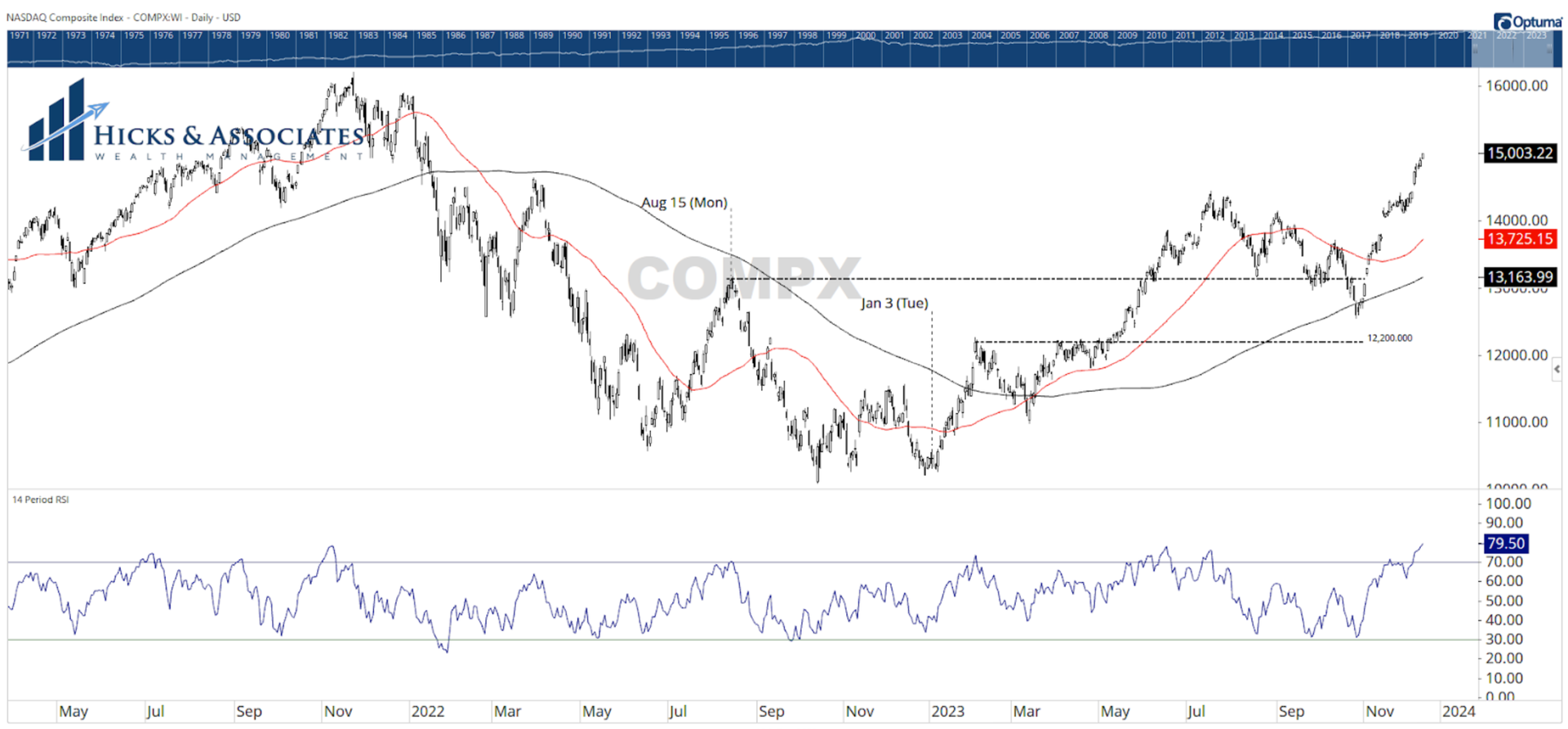
Yesterday, the NASDAQ closed above 15,000 for the first time since mid-January 2022. The last time the tech heavy index was at this level, it was testing the 200-day moving average for support. That moving average failed to serve as support and the bear market kicked into high-gear. So, while we can celebrate that the NASDAQ is back above 15,000, recall what we discussed on Monday; the tech sector is the most stretched out of all of the main eleven market sectors. As a result, it would be perfectly natural to see a pullback here. Examining the 14-period RSI (bottom pane), we see a very overbought reading. We see similar RSI readings in November 2021, February 2023 as well as June and July 2023. Each time the index sold off; sometimes more than others, but nonetheless it sold off. As a result, if you are looking to buy a tech related ETF, you might want to wait to buy on a pullback. Since we do not know if we will get that pullback, you could also split the baby; buy half of your planned allocation now. Then, add the remaining half on the pullback - if the pullback happens. |
|
|
Financial market research from professionals at the forefront of technical analysis innovation. |
|
|
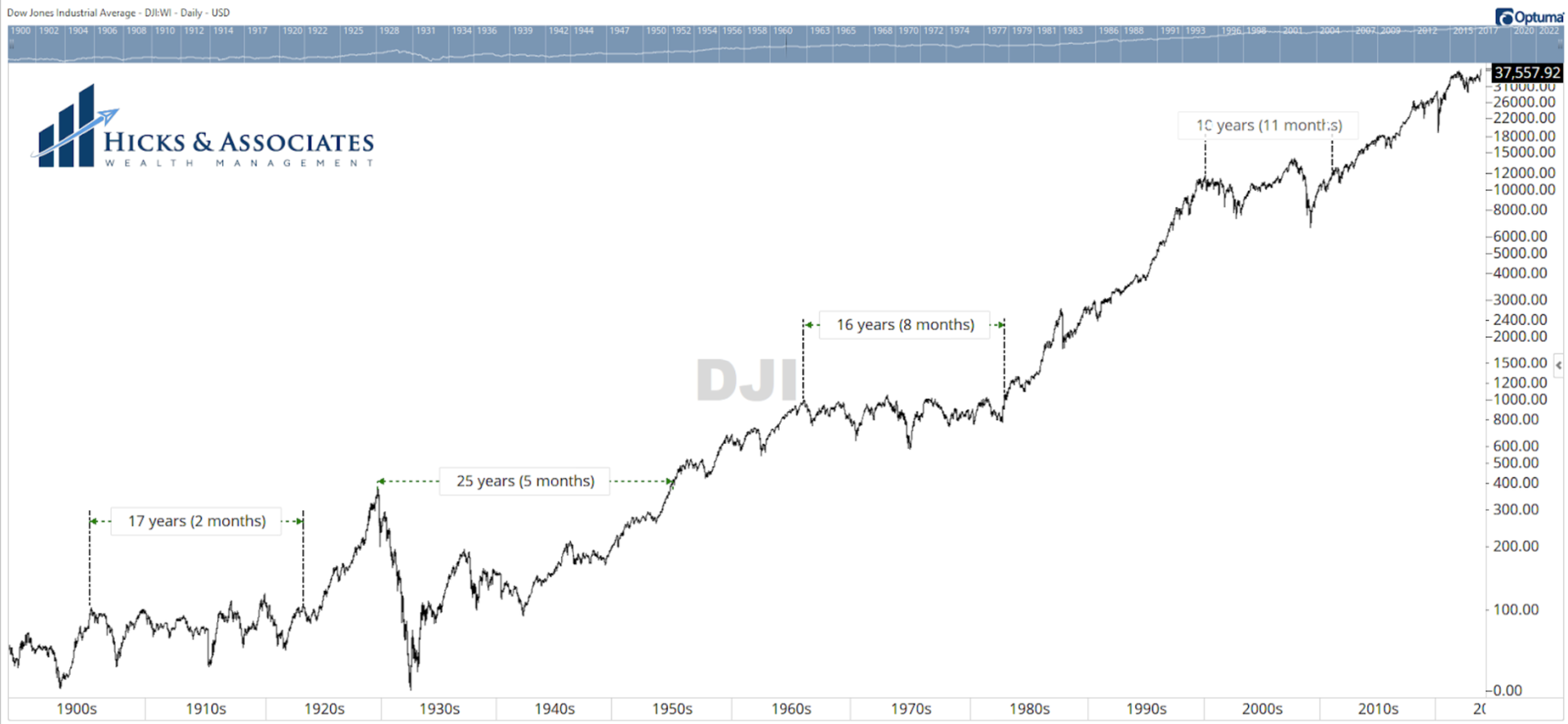
Chart 2 is one of my favorite charts. This is the Dow Jones Industrial Average going back to 1900. Every once in a while, we dust off this chart and show our clients and prospective clients. This is why we manage money actively. The time stamps on the chart are showing the approximate length of time it took the Dow Jones Industrial Average to reclaim a prior level. We manage money actively because we cannot know for certain how the next month, year or decade is going to go. Most of our clients are near retirement, or have already retired. As a result, we think defense first. But this reality is just as important if you are younger and in your accumulation years. Losses work geometrically against you! If you want to see an illustration of this concept, watch this video entitled Portfolio Math. |
|
|
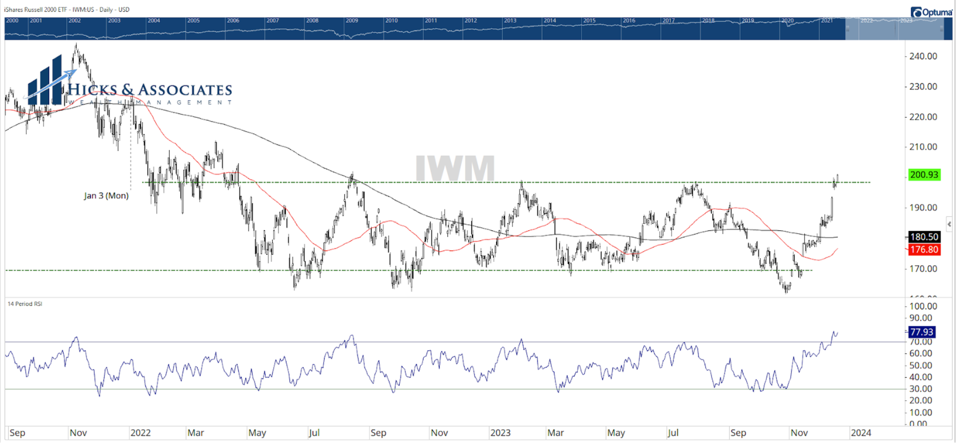
Chart 3 is the daily candle chart for the iShares Russell 2000 ETF, IWM. We frequently use this ETF as a proxy for small-cap stocks. As a reminder, the term “small cap” refers to small capitalization. Said more simplistically, small caps are smaller companies. (You can learn more in this Investopedia article: What Are Small-Cap Stocks?) As we illustrated earlier this week, in a healthy bull market we would see broad participation from all (or at least most) of the various market sectors. This would include smaller companies. Much ink has been spilled this year about how The Magnificent 7 stocks have basically been doing all the heavy lifting in the S&P 500. Chart 3 is showing us that this might be changing. Chart 3 is showing history back to the end of 2021. I added the green horizontal lines to the chart to make it easier to see that small company stocks have been in a trading range for more than two years. However, yesterday, IWM closed above this upper range. That is certainly good news. A closer examination of the chart would show that small-cap stocks pulled back just a little Friday and Monday. But Tuesday, they closed higher - actually at new highs for the year. |
|
|
Small Caps Out-Performing |
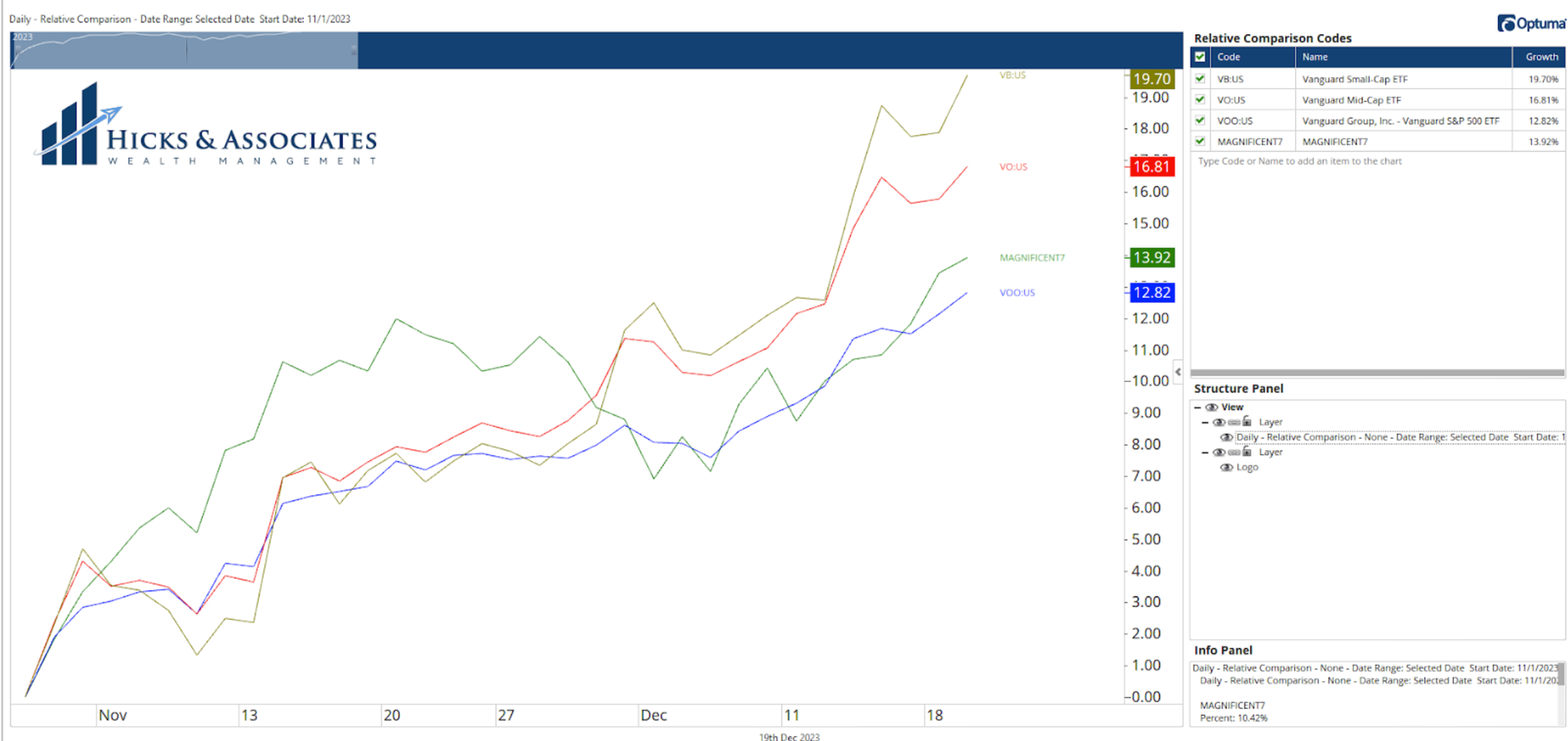
Starting in late July, the US stock market went through a minor correction. The concern was whether or not it was a minor correction within a bull market, or the resumption of the bear market. Since November 1st, the US stock market has experienced a tremendous rally. Chart 4 is telling us that, during this rally, it is small-caps that have led the way. Chart 4 is a simple comparison chart. Here I am showing three ETFs since the latest rally began on November 1st. The blue line is VOO, the Vanguard S&P 500 ETF. The red line is VO, the Vanguard Mid-Cap ETF. The olive line is VB, the Vanguard Small-Cap ETF. The fourth line on the chart is a custom index that represents The Magnificent 7. Note that The Magnificent 7 have not been leading this latest rally. This latest rally has been led by Small-Caps, followed by Mid-Caps. This is another healthy sign. |
|
|
Theodore Hicks, CMT is the Founder and Chief Investment Officer for Hicks & Associates Wealth Management, an SEC Registered Investment Adviser. Hicks and his team manage money for families and retail clients using a proprietary, multi-strategy investment process through a rules-based framework. Since most of their clients are either near or already in retirement, the process is designed to minimize downside risk. Hicks frequently posts charts and his thoughts to his LinkedIn and Twitter accounts. |
|
|
You are receiving this newsletter because you subscribed to the Chart Advisor newsletter. If you wish to unsubscribe, please click here. Dotdash Meredith 225 Liberty St, 4th Floor, New York, NY 10281
© 2023 All Rights Reserved. Privacy Policy | Terms of Service |
|
|
|