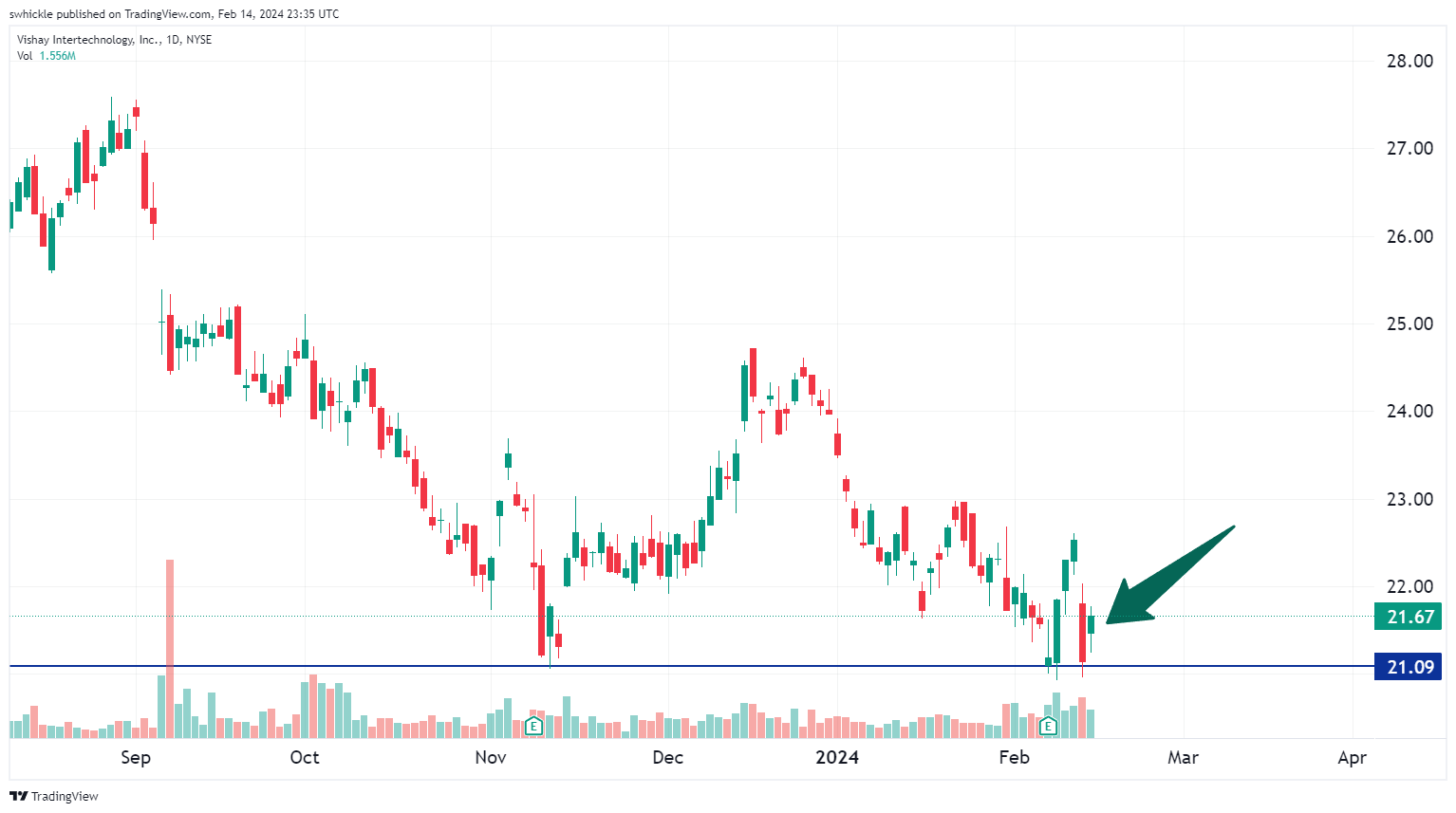
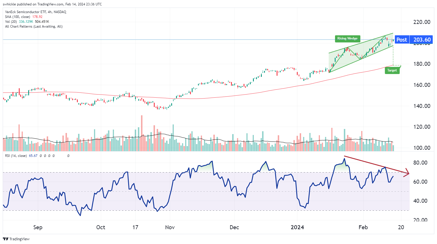
In my analysis, the type of chart I tend to gravitate toward are known as candlestick charts. To the untrained eye they appear as random mix of red and green confusion. When you get to know how to use them, they can change the way you look at price movement. This technique is nothing new as it is thought to have been developed by a Japanese rice trader in the 18th century.
Rather than using a simple line chart with a single data point, candlesticks tell us what the low, high, open, and close of a given period. This helps us visualize the stocks trading range in relation to the open or close.
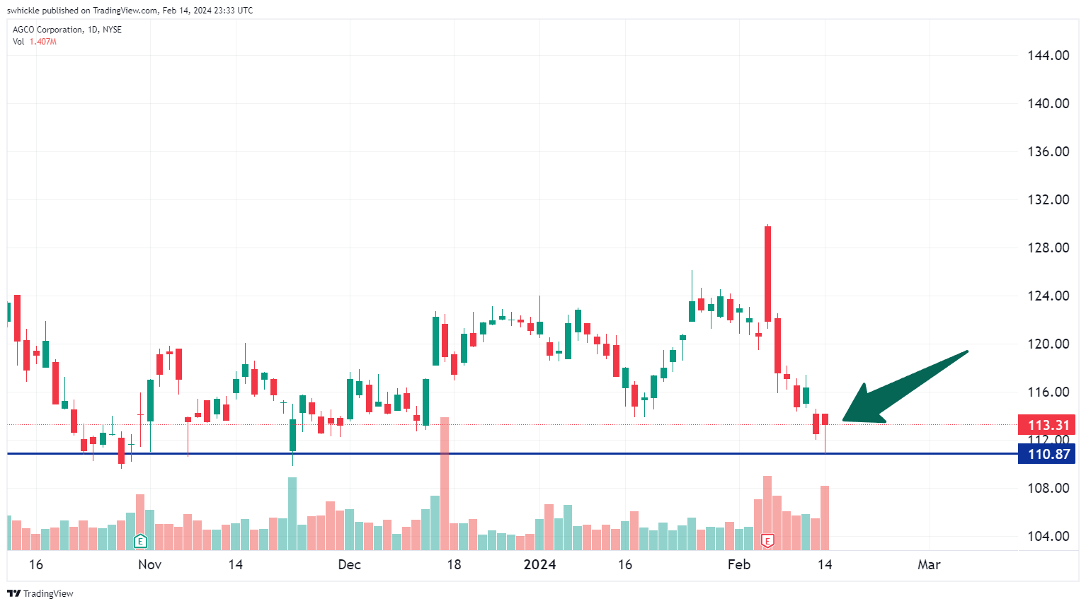
Not every candlestick helps us shine light on what could happen but there are some that can give us clues as in the case of AGCO Corporation (AGCO). AGCO reported earnings on Feb 6th and since then has traded off its highs and right back down to a multi-month support level. The type of daily candlestick from yesterday is known as a “Hammer” which is characterized by having a narrow real body with an elongated lower wick. To qualify as a Hammer the lower wick needs to be at least 2 times the length of the real body.
What makes the pattern form is the interesting part. During the trading period the sellers begin pouncing on the stock causing it to make a new low. After being beaten down, buyers step in driving the stock back up near the opening price of the day. Effectively the bears were in charge but by the end of the period the bulls have regained control.
Confirmation of a reversal would come in the form of a follow through day with a close above the hammer on higher than average volume.