1/ The SEAF Model: Faster Markets Require Better Tools |
2/ How We Derive the SEAF Model Signals |
3/ SEAF’s “Rainbow Charts” Identify the Trends in Money Movement |
4/ Using the SEAF Model to Identify Changes in Market Sentiment |
|
|
Investopedia is partnering with CMT Association on this newsletter. The contents of this newsletter are for informational and educational purposes only, however, and do not constitute investing advice. The guest authors, which may sell research to investors, and may trade or hold positions in securities mentioned herein do not represent the views of CMT Association or Investopedia. Please consult a financial advisor for investment recommendations and services. |
|
|
The SEAF Model: Faster Markets Require Better Tools |
Courtesy of Asbury Research LLC |
During the latter part of the 2010s I noticed that sector rotation was speeding up. That is, the relative trends of the individual market sectors versus the S&P 500 were faster and weren’t lasting as long. I attribute this to the continued sophistication of markets via algorithmic trading but, regardless of the reason, sector rotation is a much faster track than it used to be. As a result, I started to search for a better way to find these trends sooner, before they became readily apparent on a relative performance chart, and to notice when they were ending faster. I started tracking the flow of money into and out of these sectors, as investor asset flows are one is one of the only metrics I know of that actually leads price movement. This research resulted in Asbury Research’s creation of the SEAF Model, which is an acronym for Sector ETF Asset Flows. The SEAF Model quantitatively identifies long / overweight opportunities in US market sectors by “following the money” as it moves around the 11 Select Sector SPDR ETFs. The model enables us see the money moving before the trends this money movement creates becomes apparent on a price chart. |
|
|
Financial market research from professionals at the forefront of technical analysis innovation. |
|
|
How We Derive the SEAF Model Signals |
Courtesy of Asbury Research LLC |
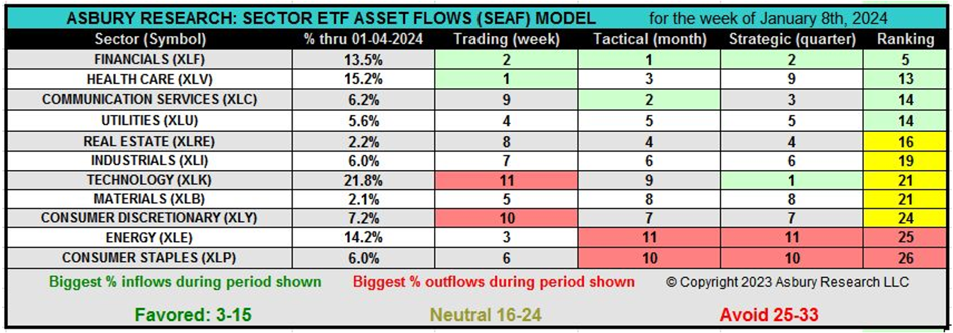
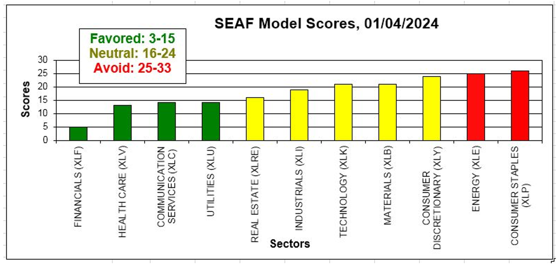
Our methodology measures the velocity of money moving into and out of the 11 sector SPDRS ETFs in three different time frames: Trading (weekly), Tactical (monthly), and Strategic (quarterly). The premise of the model is to invest in the sectors that the money is going into and to avoid the sectors the money is coming out of. The top two sectors in each category according to a positive change in inflows are highlighted in green. The top two sectors in each category according to a negative change in outflows are highlighted in red. We then add up the scores in each time period to produce a composite Ranking. Favored sectors have a Ranking between 3 and 15 (green), Neutral sectors have a Ranking between 16 and 24 (yellow), and Avoid sectors have a ranking between 25 and 33 (red). The SEAF Model is rebalanced once a week, on the weekend, to reflect the movement of money over the previous week. The chart above shows that the SEAF Model currently favors Financial (XLF), Health Care (XLV), Communication Services (XLC), and Utilities (XLU) and is avoiding Energy (XLE) and Consumer Staples (XLP). |
|
|
SEAF’s “Rainbow Charts” Identify the Trends inMoney Movement |
Courtesy of Asbury Research LLC |
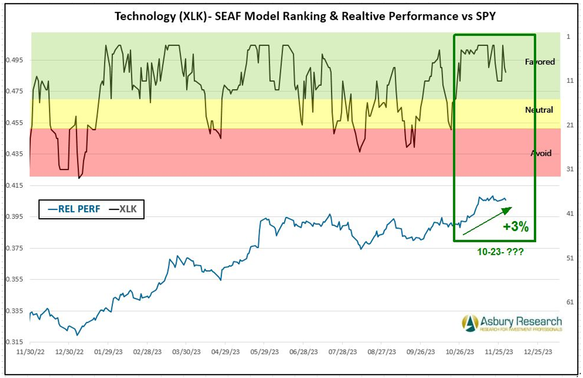
The first two graphics display the latest sector rankings accordind to the SEAF Model, in both table and chart form. However, the movement of investor assets moving in and out of the various sectors tend to trend just like price itself, as the movement of money is a major influences in the creation and sustainability of these trends. We created SEAF Model “Rainbow Charts” to highlight these trends. The Rainbow Chart shown includes 12 months of SEAF Model Rankings through December 1st in the upper panel, with a corresponding chart of the relative performance of the Technology Select Sector SPDR Fund (XLK) versus the SPDR S&P 500 ETF (SPY) in the lower panel. The green highlights show that the SEAF Model ranking for the XLK initially moved to a Favored status on October 23rd while (XLK) coincidentally outperformed SPY by 3% through December 1st. Not shown is that Technology subsequently moved out of Favored status on December 29th after capturing a 13.8% outright gain while outperforming the S&P 500 (SPY) by 3.5%. |
|
|
Using The SEAF Model To Identify Changes In Market Sentiment |
In addition to indicating where the money is going in US market sectors, we use SEAF to provide us with a broader understanding of current market conditions. For example, in the SEAF Model graphic above we can see that defensive Health Care and Utilities are two of this week’s four Favored rankings. Then, on the opposite end of the spectrum, offensive Consumer Discretionary and Technology are the 10th and 11th ranked, or two weakest, sectors in the Trading (weekly) time frame. I interpret this as an early indication that investor assets are shifting from more aggressive, “risk on” sectors, where they have resided since late October, to more defensive places – perhaps in anticipation of an overdue downside correction in the US broad market. More information and data pertaining to our SEAF Model research and data driven models, including the SEAF Model, are available by clicking here. |
| |
John Kosar, CMT was awarded the Chartered Market Technician (CMT) designation in 1999, served as Vice President of the CMT Association from 2004 to 2006, and was a member of its Board of Directors from 2002 to 2006. John began his career in 1980 on the Chicago Mercantile Exchange trading floor and spent the next 17 years there, acquiring a practical, real-world understanding of what really drives financial asset prices. John is the founder and Chief Market Strategist of Asbury Research, a Registered Investment Advisor he launched in 2005, which provides data-driven technical and quantitative investment research to professional and private investors. John can also be found on Asbury Research’s YouTube channel where he produces Asbury Research’s bi-weekly Following The Money podcast and additional investment information. |
|
|
You are receiving this newsletter because you subscribed to the Chart Advisor newsletter. If you wish to unsubscribe, please click here. Dotdash Meredith 225 Liberty St, 4th Floor, New York, NY 10281
© 2024 All Rights Reserved. Privacy Policy | Terms of Service |
|
|
|