3/ AAII Bulls Minus Bears |
|
|
Investopedia is partnering with CMT Association on this newsletter. The contents of this newsletter are for informational and educational purposes only, however, and do not constitute investing advice. The guest authors, which may sell research to investors, and may trade or hold positions in securities mentioned herein do not represent the views of CMT Association or Investopedia. Please consult a financial advisor for investment recommendations and services. |
|
|
Source: StayVigilant.Substack.com, Bloomberg |
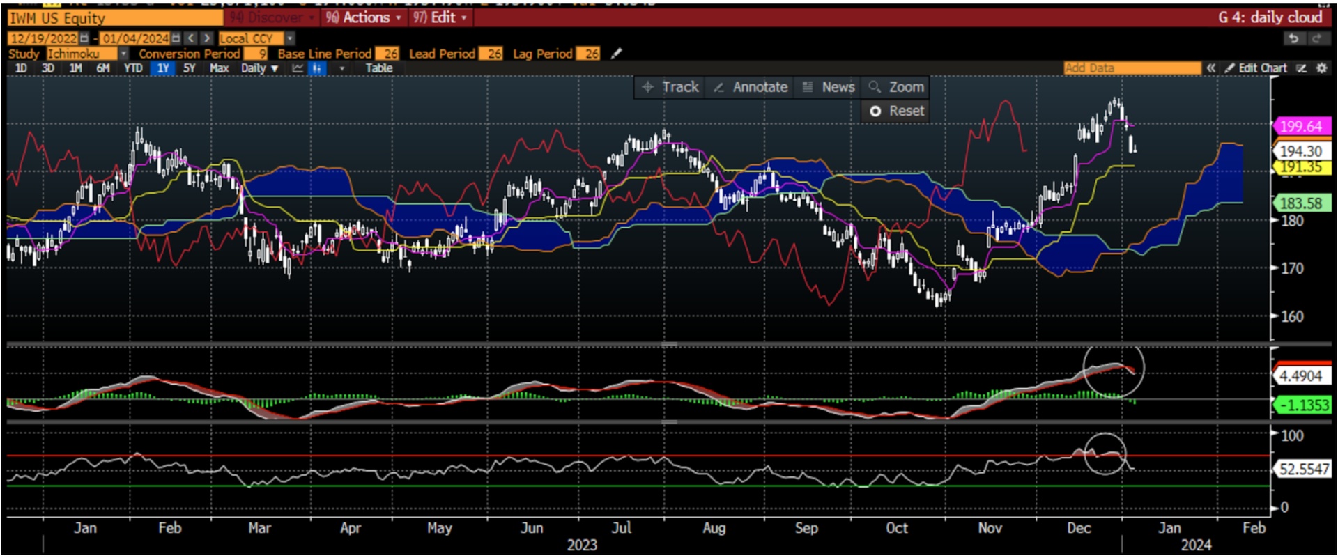
This week we have been looking at the market using intermarket analysis trying to assess the fundamental trend and the technical indicators that can give us a guide to what can happen with markets in the short and medium term as we enter the new year. We have seen some signs of a recession as we look forward, be that the continued inverted yield curve, leading economic indicators or the ISM. It should not be surprising that consensus economists see a very high probability of a recession in the next 6 months. Perhaps the cause of this is the restrictive policy of the Federal Reserve which has historically led to a weaker economy and lower stocks. Even the H.O.P.E. indicator is pointing lower with the recent rollover in housing, though the pullback in mortgage rates may suggest this is just short term weakness. At this point in the process, I am now starting to dig into more specific measures that can give me near-term actionable ideas. This is when I turn to things such as daily charts to give me a signal for how I should be thinking of ideas that may have percolated earlier in the process. A chart I have used since my days in FX in Asia, is the ichimoku kinko hyo chart. It translates to one glance equilibrium chart’ and there is a tremendous amount of information in the one chart. Without getting into the weeds too much, the cloud is the area of the market where the majority of investors have gotten either long or short. When the cloud is rising, it shows investors bullishness as they are willing to pay higher prices on average. When it is falling, investors are getting more bearish. Thus, we care where the current price (white candles) are in relation to the cloud. As the current price is well above the region where people have gotten long or short, this shows the bulls are firmly in control of the tape right now. The lagging span (red line) is a delayed measure of strength and it is also above the cloud suggesting a very strong tape for IWM right now. I added two elements to this chart to give me extra information. In the middle panel is the MACD or moving average convergence divergence. This tells us the direction of moving averages and whether they are pointing in the same direction or at risk of crossing. We can see these moving averages have been pointed in the same direction - higher - for the last two months, a sign of strength. However, we can see that they are starting to flatten out and the shorter moving average is beginning to look like a risk of moving below the longer moving average. This is a yellow flag, not yet a red flag, and indicative of a trend that is weakening. A momentum indicator that I use that can corroborate this is the RSI or relative strength index, in the bottom panel. I use the default setting of 30 and 70 which tells me that when the price is above 70% of the readings of the last year or below 30% of the readings of the last year. This indicates overbought or oversold conditions. You can see this reading just hit 72 which is not only high in absolute terms but is higher than any RSI reading of the last year, telling me the IWM is currently very overbought, another short-term yellow flag. It is now correcting and further suggesting more near-term risk. Well the trends look strong for IWM, there are still some yellow flags that investors should be wary of. |
|
|
Financial market research from professionals at the forefront of technical analysis innovation. |
|
|
Source: StayVigilant.Substack.com, Bloomberg |
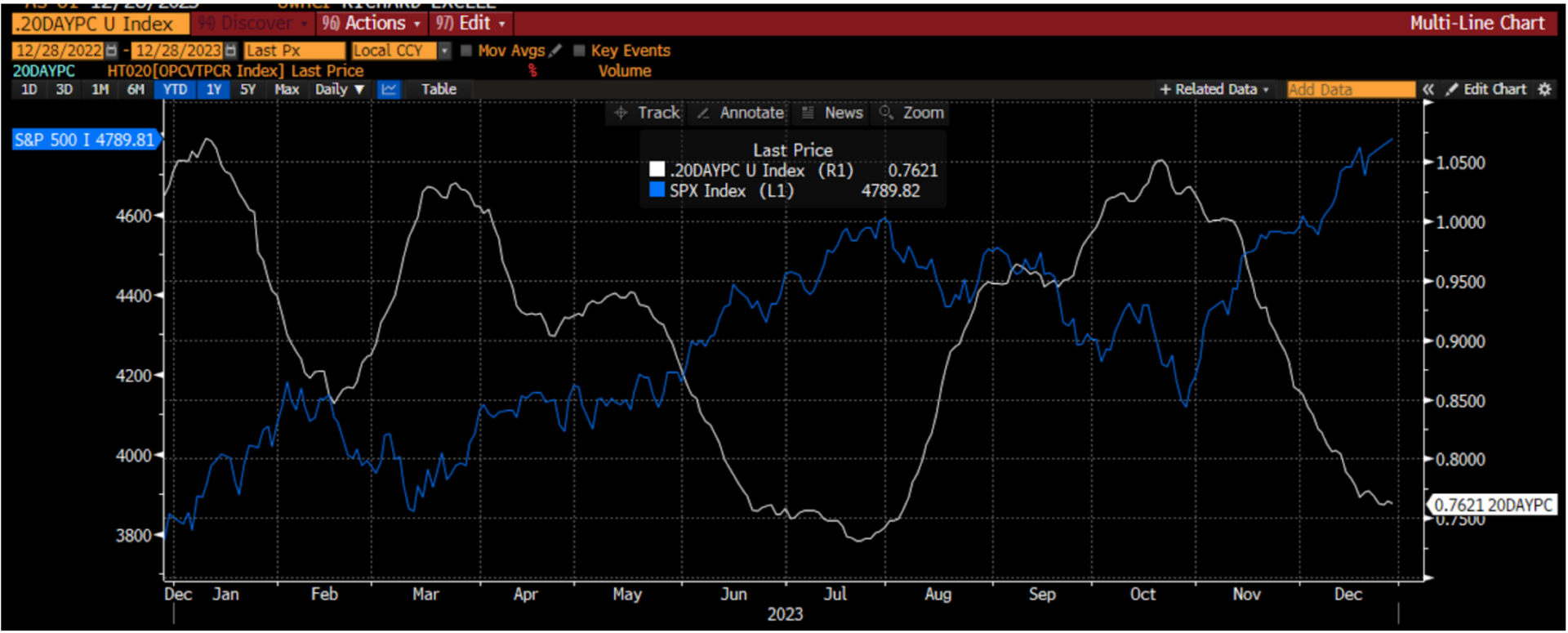
My single favorite measure for short-term performance is the ratio of put volume to call volume in the options market. I look at a 20 day moving average to smooth out the noise. I began my career in the options market and have used options extensively throughout my career. I understand the important information that can be gleaned by assessing what investors are doing in the options market. Are they seeking insurance? Yield enhancement? Leverage to a directional move? While I can’t glean all of that from a single indicator, I find that the ratio of the put-call 20 day moving average does a very good job of indicating, or at least confirming, market direction in the short-term. When this ratio is falling, investors are trading more call options on a relative basis. This may be for yield enhancement or for directional leverage but either way it indicates investors are largely feeling pretty positive. When put volumes go up on a relative basis, investors are feeling nervous, as they do not systematically hedge but rather hedge when needed as option premium can be a drag on performance. We see this in the chart. As the white line moves lower, investors are more bullish and the SPX heads higher. As the white line moves higher, investors are getting more bearish at the margin and the SPX begins to move lower. This index has been heading lower for the last two months. It looks like it is beginning to bottom and may head higher. This is another yellow flag for me. Not actionable to short the market, but certainly something I am watching closely. |
|
|
Source: StayVigilant.Substack.com, Bloomberg |
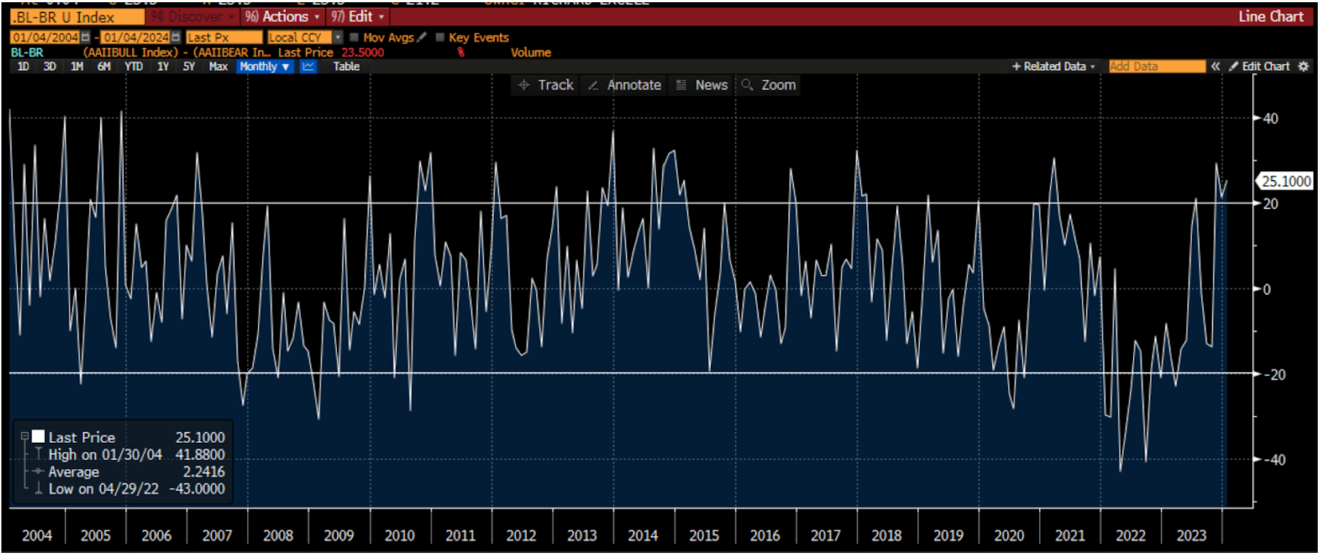
The final measure I want to consider is the American Association of Individual Investors Bulls. Vs. Bears measure. This is a long-time newsletter that assesses whether individuals are bullish, bearish or neutral. I have found that looking at the difference between bulls and bears can give me a good sense for when investors are too bullish or too bearish. There are some that say this measure is no longer relevant as the market structure has changed through the years. However, I find it works as well now as it has always worked. The critical areas for me are when bulls outnumber bears by more that 20% (the upper vertical line) or when bears outnumber bulls by more than 20% (the lower vertical line). Right now, bulls outnumber bears by about 25%, which tells me there is some widespread enthusiasm in the market among small investors, another yellow flag that I see as I look through the charts. In summary, there are more warning signs than all-clear signs as I look through the short-term technical indicators, something we should all be wary of. |
| |
Source: StayVigilant.Substack.com, Bloomberg |
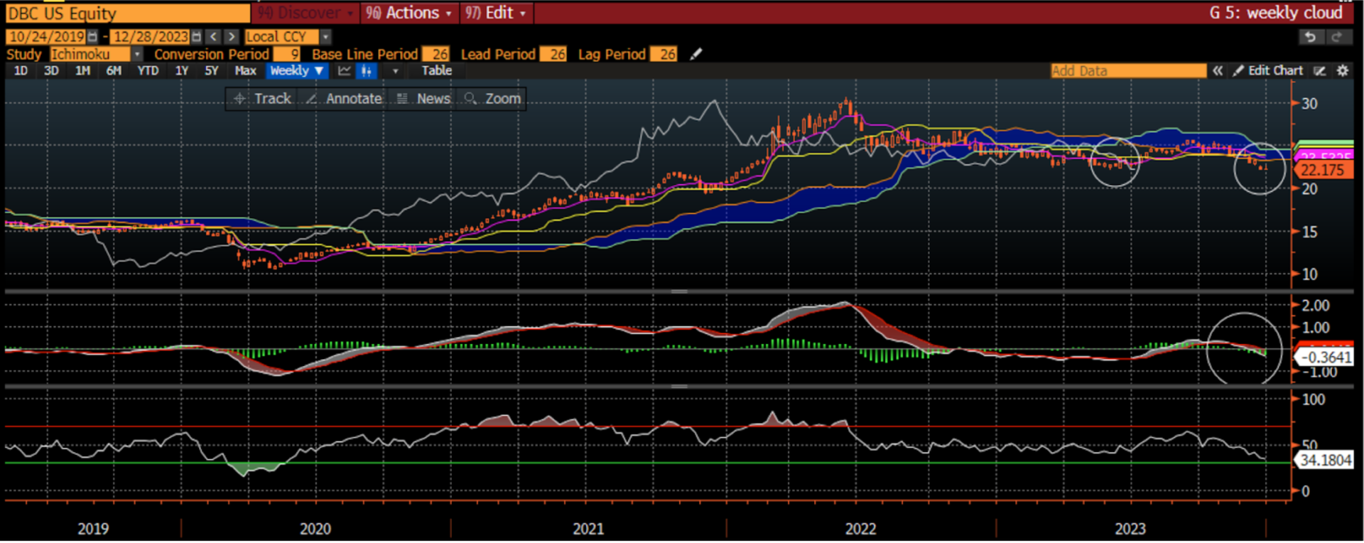
This week we have been looking at the market using intermarket analysis trying to assess the fundamental trend and the technical indicators that can give us a guide to what can happen with markets in the short and medium term as we enter the new year. We have seen some signs of a recession as we look forward, be that the continued inverted yield curve, leading economic indicators or the ISM. It should not be surprising that consensus economists see a very high probability of a recession in the next 6 months. Perhaps the cause of this is the restrictive policy of the Federal Reserve which has historically led to a weaker economy and lower stocks. Even the H.O.P.E. indicator is pointing lower with the recent rollover in housing, though the pullback in mortgage rates may suggest this is just short term weakness. Lately we have seen the laggards in the market showing improving signs with emerging markets, small caps, dividend stocks, buywrite ETFs and bonds all doing well. In fact, small caps have done so well in the last two months that the daily chart is looking overbought on the RSI and the MACD may be rolling over. Add to this, short-term indicators like the AAII Bull minus Bear and the Put-Call ratio are giving some yellow flags that short-term there might be some risks. With this in mind, it is time to look at the weekly charts across several asset classes to see where they stand. As it stands, investors are often faced with a choice of bonds, commodities, domestic stocks and international stocks. Sure, there could be other choices but these tend to dominate most 401(k) decisions. The first asset I want to look at is the commodity market and I use the DBC ETF as the measure here. I use a weekly ichimoku chart with a MACD and RSI to get a sense of trend and momentum. I have circled here three things which I want to draw to your attention. The first is that prices have broken below the ichimoku cloud, which means that the bears are now in control of the tape. Not only that, the lagging span has also broken below the cloud which is indicative of a stronger negative signal. Add to this, the MACD has crossed below and is trending lower. All signs are indicative of a lower commodity market in the medium term. This ETF is not yet oversold so one can’t make the case it is overdone. The question an investor should have when they see that is whether the weakness in commodities is being driven by higher supply or lower demand. Is global growth slowing so much that commodities weaken or have prices fallen so much that companies are producing more supply. |
|
|
Source: StayVigilant.Substack.com, Bloomberg |
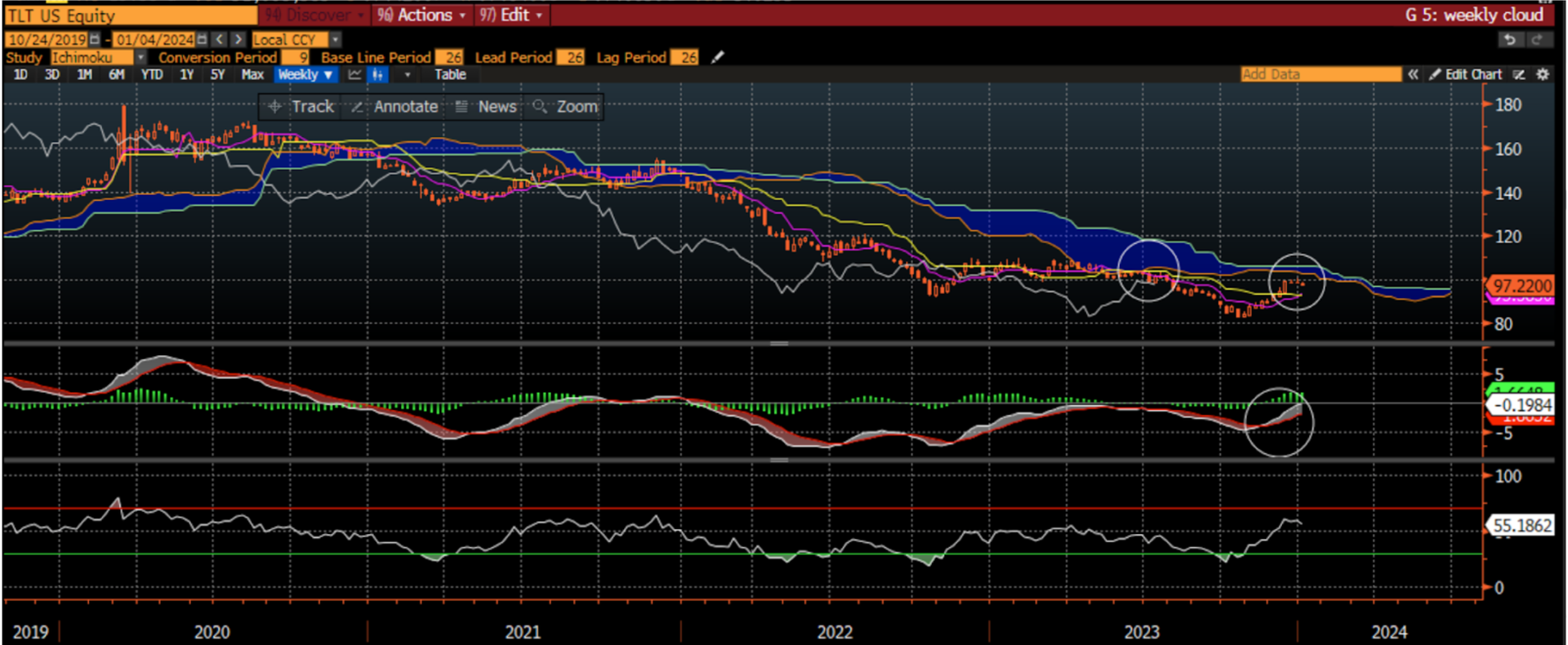
The second chart I want to consider is the TLT ETF which is what many investors use for the bond market. As the ETF is actually an index of bonds with 20+ years to maturity, it has a longer duration than 10-year US Treasuries. However, as it is more easily traded by more investors, it tends to be the one most people follow. I have also drawn three circles on this chart. The first two indicate that the bond market is running into some resistance at the ichimoku cloud, with both prices and the lagging span running into the cloud here. Before people think this suggests that prices should turn around and head lower, I would draw your attention to the circle in the middle panel, the MACD, where the trend is still pointing higher. While there may be some resistance, the trend is still higher and so a consolidation might be more likely in the bond market. This may be consistent with either falling inflation or slowing growth, both of which we can discern from the DBC chart. |
|
|
Source: StayVigilant.Substack.com, Bloomberg |
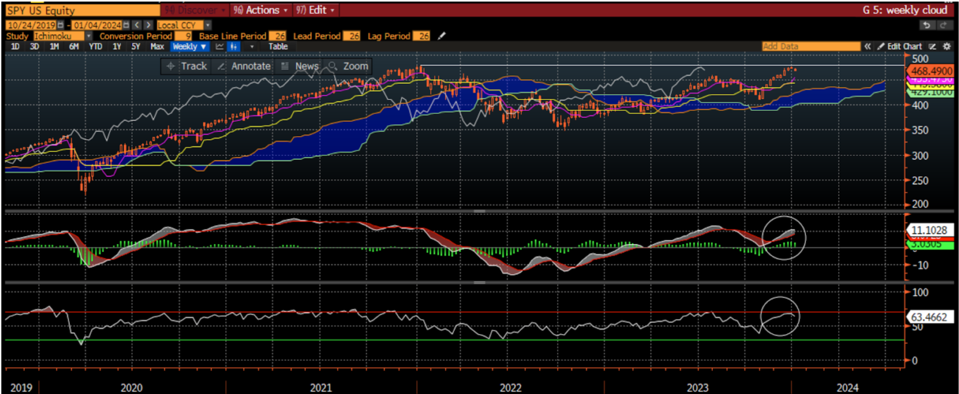
Finally, the chart that is probably the most discussed chart in the world. This is the chart of the SPX Index. In this case I look at the weekly ichimoku cloud with MACD and RSI again, but using the SPY ETF to stay consistent with the other ETFs. On this chart I have drawn a vertical line in the top panel which is drawn at the 2021 highs showing that while the bulls are in control with prices above the cloud, they are running into resistance at the old highs. The momentum indicator in the bottom panel (RSI) is also into overbought territory which may corroborate that we are running into resistance at these levels. The middle panel is still showing that the trend is higher and so any weakness would be consolidation of gains and not the start of a broader move lower. Once again, this is probably more consistent with falling inflation and not any concerns on the economic growth front, even though we can see there are reasons for that from the economic data. In fairness, for all of 2023, we had reasons to be negative based on economic data but the price action of the market told us to stay positive. This may be one of those times again. I hope this week you have been able to learn a little bit about my process which may have taught you some new tools to use that will help your own. Good luck in 2024 and Stay Vigilant! |
| |
Rich Excell, CFA, CMT is a 30-year hedge fund and proprietary trading veteran who has lived and worked in Asia and Europe in addition to the United States. He has run investment businesses spanning equities, fixed income, commodities and foreign exchange. Rich is now a Clinical Assistant Professor of Finance at the Gies College of Business, University of Illinois, Urbana-Champaign. He also is the host of the Investment Exchange Forum and Macro Matters podcasts for the CFA Society Chicago and writes a bi-weekly options trading blog ‘Excell with Options’ for the CME Group. Finally, he writes a weekly Substack blog called ‘Stay Vigilant’ which aims to demystifinance for the average investor. |
|
|
You are receiving this newsletter because you subscribed to the Chart Advisor newsletter. If you wish to unsubscribe, please click here. Dotdash Meredith 225 Liberty St, 4th Floor, New York, NY 10281
© 2024 All Rights Reserved. Privacy Policy | Terms of Service |
|
|
|