By C. Theodore Hicks II, CFP®, CKA®, CMT®
|
|
|
2/ Equals Knowing How to React |
4/ Check Your Assumptions |
|
|
Investopedia is partnering with CMT Association on this newsletter. The contents of this newsletter are for informational and educational purposes only, however, and do not constitute investing advice. The guest authors, which may sell research to investors, and may trade or hold positions in securities mentioned herein do not represent the views of CMT Association or Investopedia. Please consult a financial advisor for investment recommendations and services. |
|
|
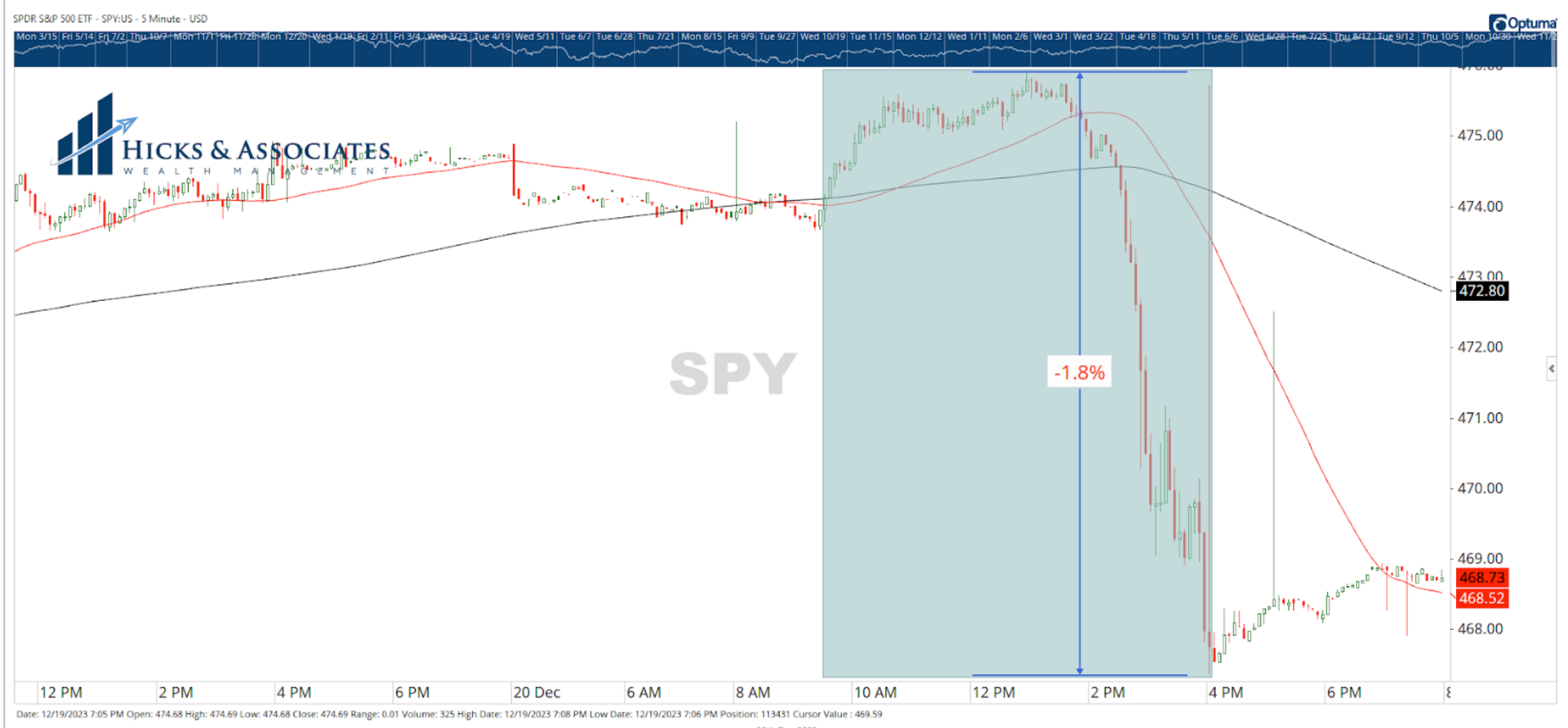
Earlier this week, I wrote that it would be reasonable to expect a pullback in the markets in the week ahead. Coming into this week, the broad market had been up seven weeks in a row. After a run like that, it is very common to see the market pause and digest the gains. Yesterday, the market began to do just that. Chart 1 shows the 5-minute chart for SPY, an S&P 500 ETF. Because this ETF is very active, my data feed into Optuma (the charting software we use) shows pre and post-market trades. The light blue box represents the 9:30 to 4:00 pm trading hours. We can easily see that the market opened and started to gradually move higher. Then, shortly after the lunch hour, the selloff began … and it was precipitous. However, when we remember the macro view that we developed over the weekend, today’s market action is not surprising. |
|
|
Financial market research from professionals at the forefront of technical analysis innovation. |
|
|
Equals Knowing How To React |
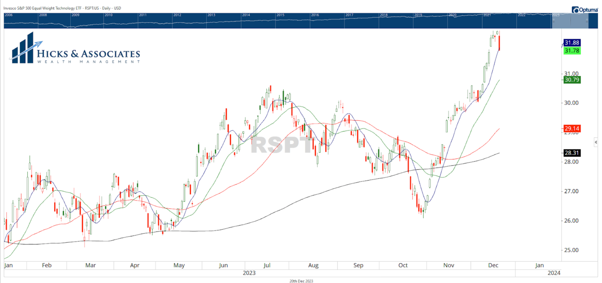
Earlier in the week, I pointed out that the technology sector was the most stretched. In other words, the tech sector was the furthest above its 200-day simple moving average (i.e. ‘stretched’). I made this point to highlight the fact that if my macro view was correct (that we could see a pullback in the week ahead) then the pullback might be the most pronounced in the tech sector since it is the most extended. What sector was hit the hardest on Wednesday? Well, the answer depends on whether you are looking at the cap-weighted sector ETFs or the equal-weighted sector ETFs. Since the equal-weighted sectors gives equal weight to each constituent, this is where I look. On Wednesday, out of the 11 equal-weight sector ETFs, the equal-weight tech ETF (shown in Chart 2) was hit the hardest. It was down ~2.03% on the day, the most out of all the 11 ETFs. Returning to our macro-view, we expected this, so there is no reason to be alarmed. In addition, look at where the ETF closed for the day - right below the 8-day moving average. Again, no surprise here. A side note: I actually do not recall why I use an 8-day moving average. It is a bit of an odd one. If I were to change my chart to a 10-day moving average (which is 2 trading weeks which makes more sense), I’d see that the ETF has a little further to fall to get back in line. My main point here is that it is important to set a macro view. If the market responds in line with your view, and you have created a plan based on that macro view, there is no reason to make any adjustments. If, however, the market does something you did not expect, then you might want to consider revisiting your macro view. |
|
|
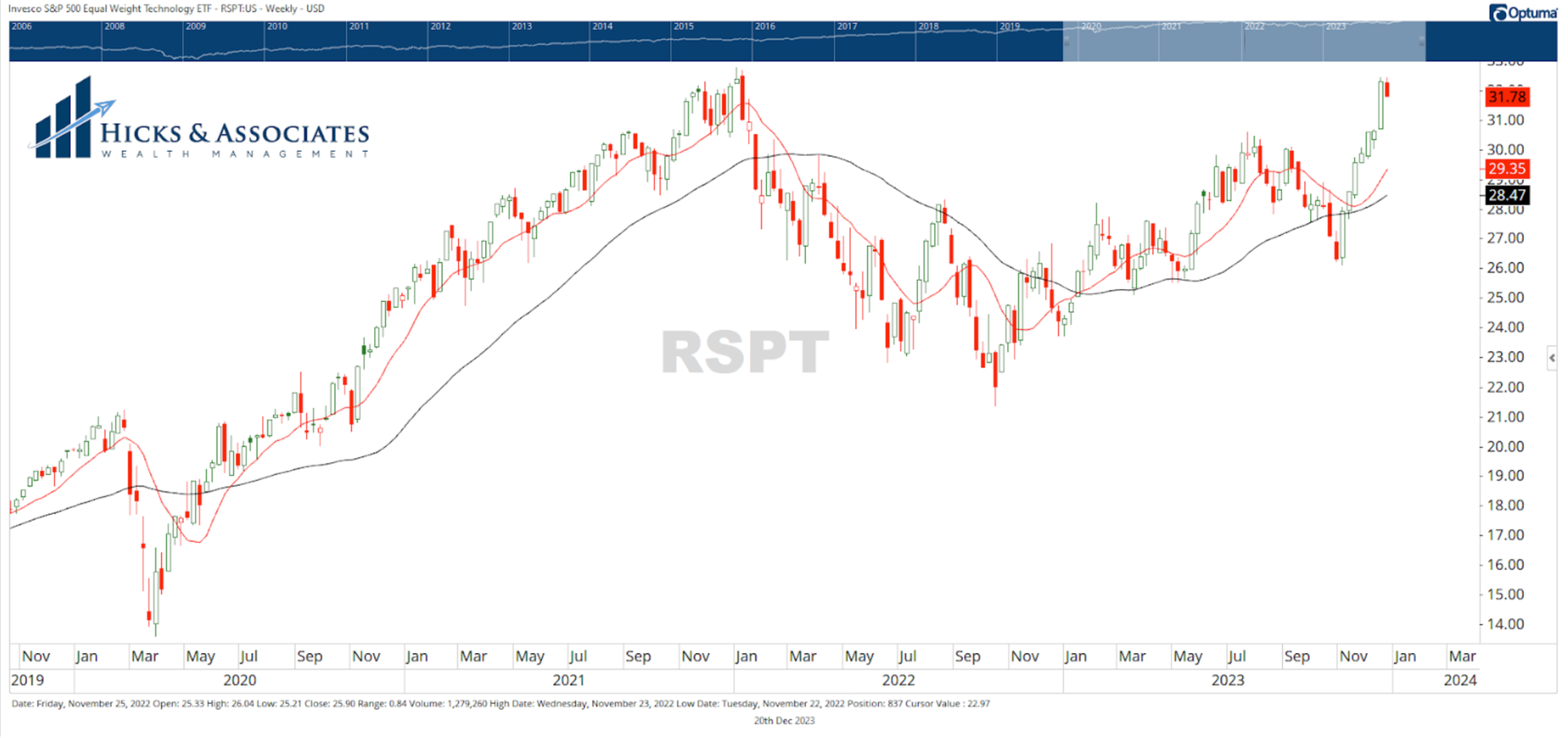
Chart 3 is the weekly chart for the equal-weight tech sector ETF. As stated in one of these newsletters earlier in the week, the vast majority of our clients are either nearing retirement or are already in retirement. As a result, we focus on risk first. If we have shifted our portfolios into a defensive posture, we do not flip back into our most aggressive offensive posture with the flip of a switch. We practice what is called “progressive exposure”. As a result of what we see underneath the surface of the indices, we have greater confidence that we are at the beginning stages of a bull market. Since November 1st, practicing “progressive exposure” we have gradually increased our allocation to equities. Therefore, we are viewing today’s selloff as an opportunity to increase our equity exposure at a better price. |
|
|
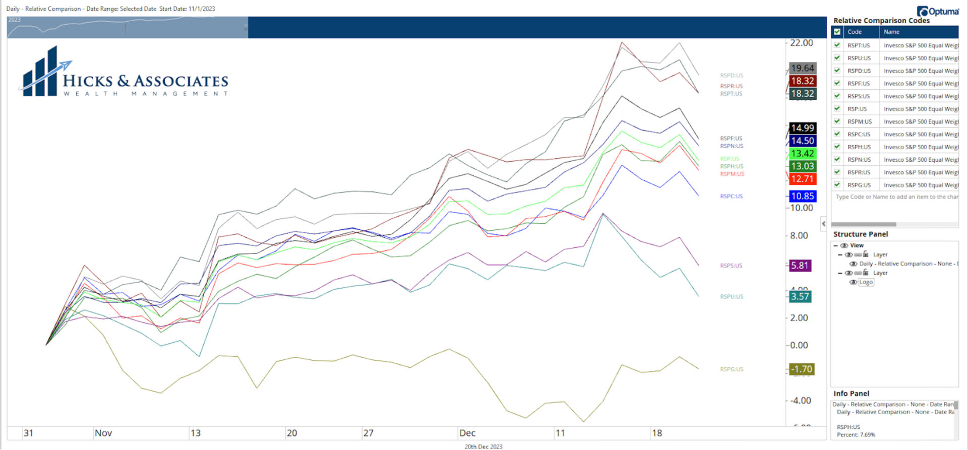
However, a review of a simple comparison chart for the equal-weight sector ETFs since November 1st reveals something that I did not expect. I fully expected RSPT to be at the top of this list. However, it is the equal-weight consumer discretionary sector that tops this chart.
This is why it is imperative to check your assumptions at the door. Check the data and proceed accordingly.
Acts 17:11 |
|
|
Theodore Hicks, CMT is the Founder and Chief Investment Officer for Hicks & Associates Wealth Management, an SEC Registered Investment Adviser. Hicks and his team manage money for families and retail clients using a proprietary, multi-strategy investment process through a rules-based framework. Since most of their clients are either near or already in retirement, the process is designed to minimize downside risk. Hicks frequently posts charts and his thoughts to his LinkedIn and Twitter accounts. |
|
|
You are receiving this newsletter because you subscribed to the Chart Advisor newsletter. If you wish to unsubscribe, please click here. Dotdash Meredith 225 Liberty St, 4th Floor, New York, NY 10281
© 2023 All Rights Reserved. Privacy Policy | Terms of Service |
|
|
|