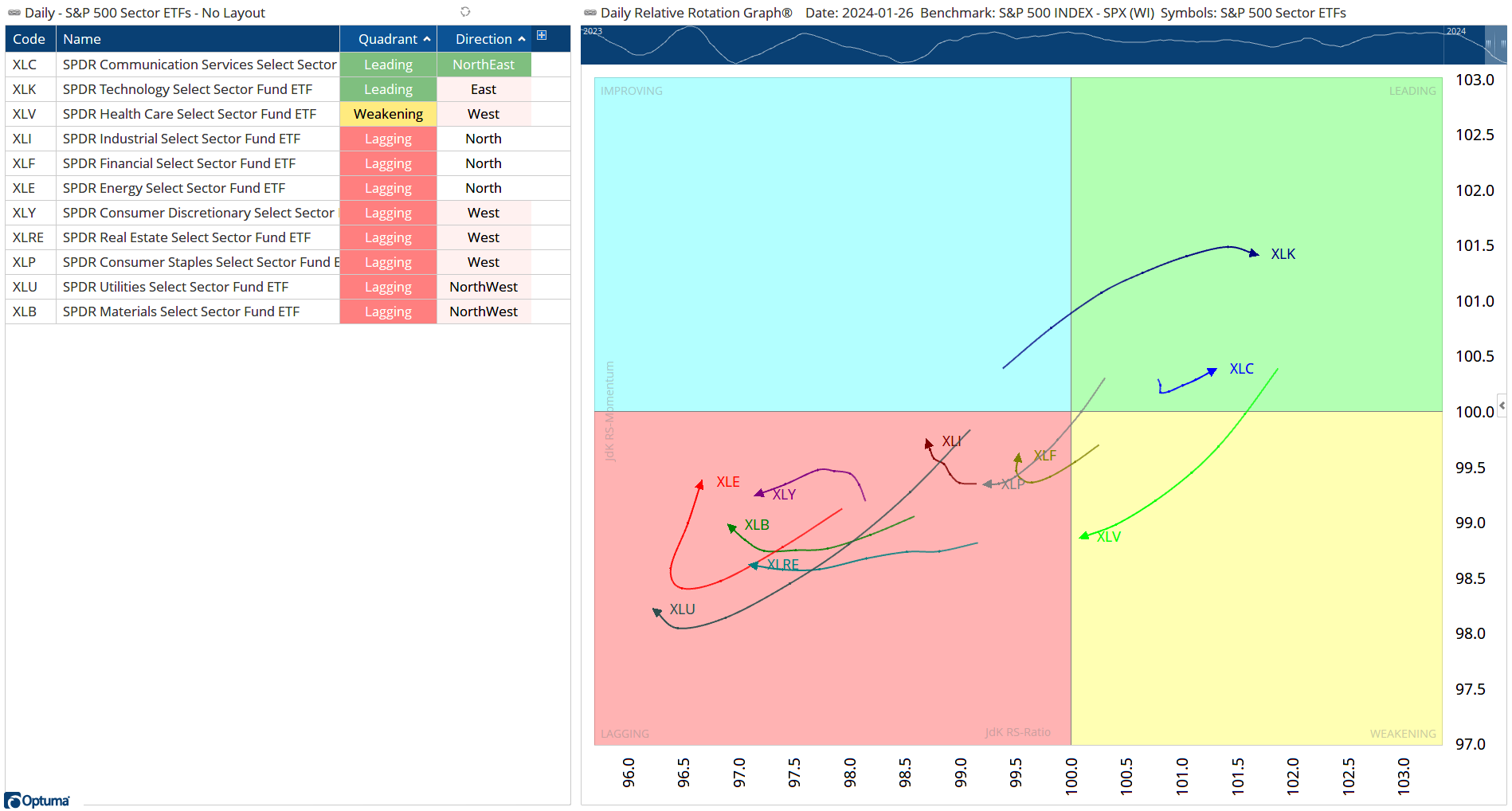
1/ Tech Leading the Market |
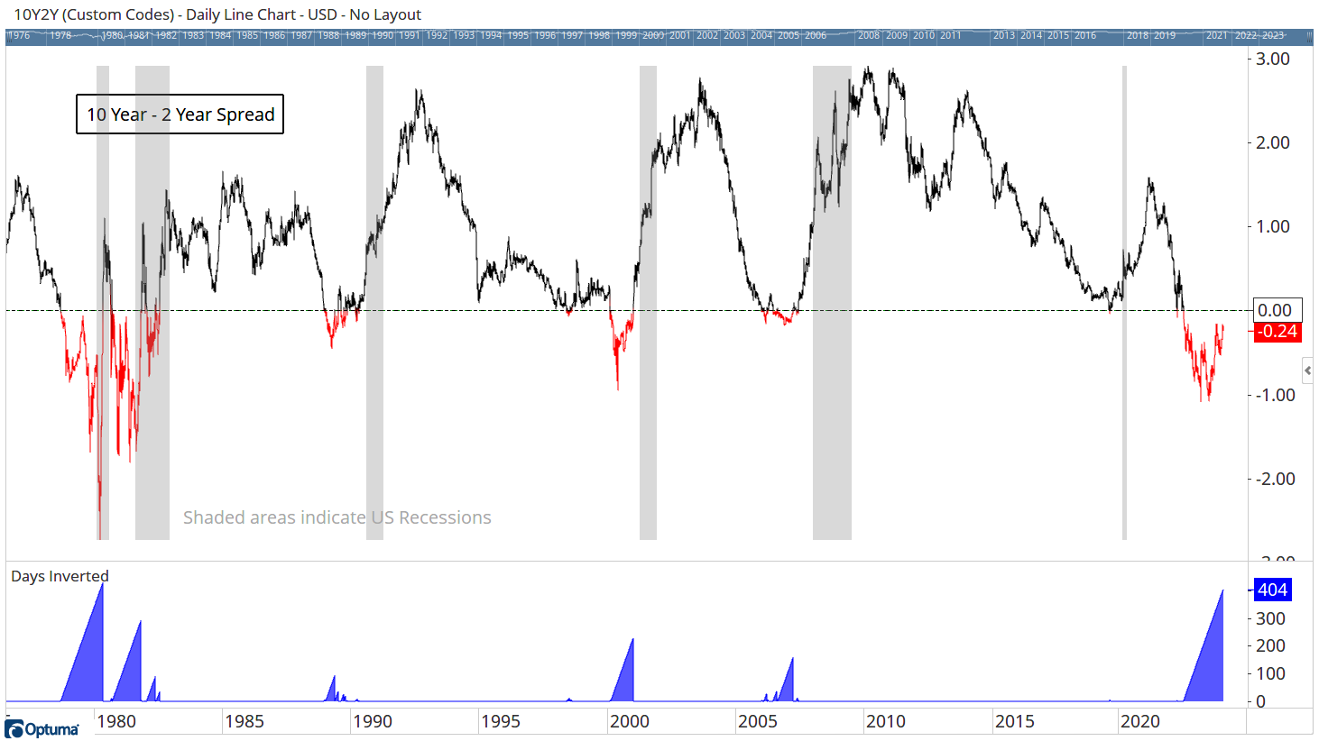
3/ 2nd Longest Period Inverted Yields |
4/ SPX - Third 20% Gain in a Row |
|
|
Investopedia is partnering with CMT Association on this newsletter. The contents of this newsletter are for informational and educational purposes only, however, and do not constitute investing advice. The guest authors, which may sell research to investors, and may trade or hold positions in securities mentioned herein do not represent the views of CMT Association or Investopedia. Please consult a financial advisor for investment recommendations and services. |
|
|
The RRG tells us how the sectors are behaving on a relative strength basis versus the S&P500. Lately we can see that only large cap sectors (Tech & Communications) are leading the benchmark S&P500 index. Eight sectors are lagging - although direction of the arrows is important, with Energy, Financials, & Industrials all moving north towards the Improving sector. Why this is so important is that professional Portfolio Managers are looking to outperform the benchmark. If they manage a US Large Cap fund, their goal is to achieve better returns than the S&P500. If they overweight (have larger position sizes) then they can get better returns. This means that we can expect some of the world’s largest funds to pay close attention to Relative Strength. If a security is outperforming, they want it in their portfolio asap. This is why the RRG is so powerful, we can see the sectors that are outperforming and likely to be added to portfolios. We can also see early signs of improvement. A security that is facing Northeast is one that is showing early signs and will be something that the large funds will be interested in. Eg in Chart 1, you can see that XLE (Energy) is one to watch over the coming days. |
|
|
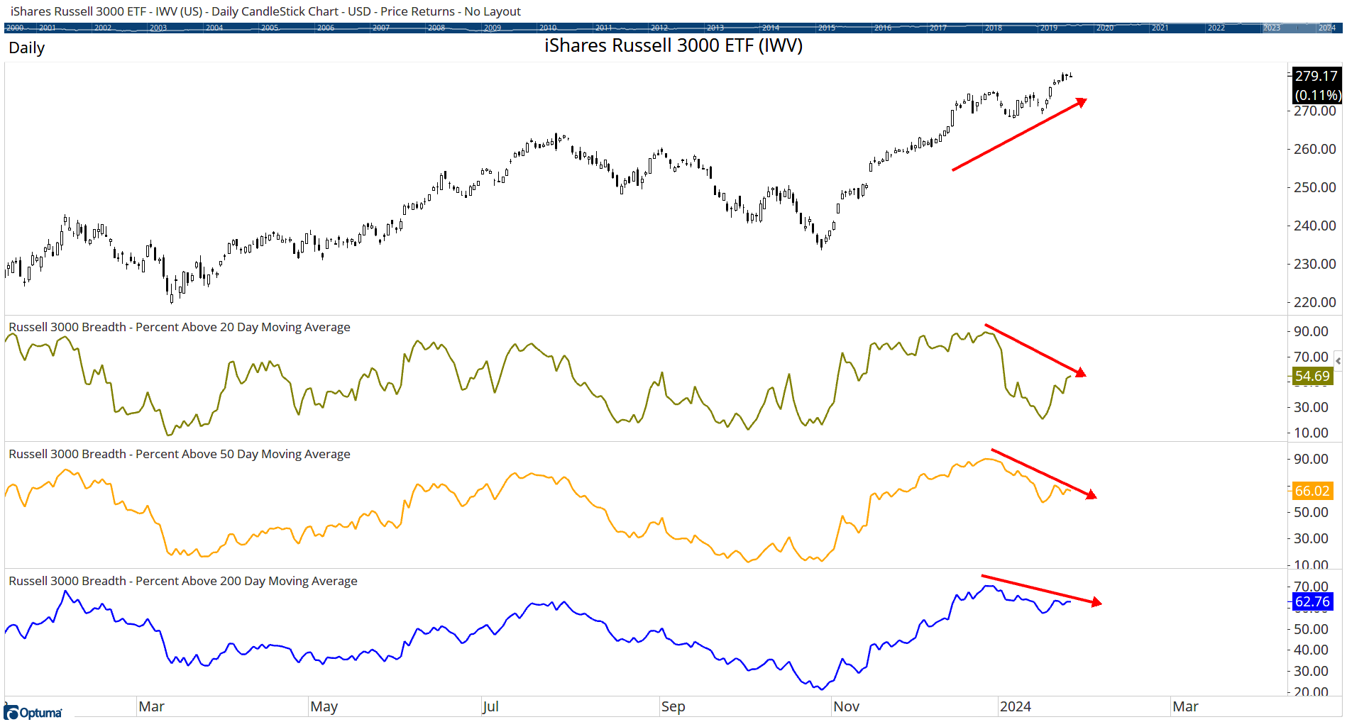
The trouble with indices is that a small group of big names (eg AAPL, MSFT, GOOG etc) have a large impact on the Index value. The way that we can look at the broad market condition is to examine Market Breadth. While there are a number of calculations that can be used for breadth, the basic principle is to count the number stocks showing a positive attribute verses those that are negative or neutral. In chart 2 we are looking at the Russell 3000 and three breadth measures all based on Moving Averages. The ‘positive condition” is simply whether the price is above the moving average. What this is telling us is that while the R3K is climbing, the majority of stocks have fallen below their moving averages. This is not always a sign of impending doom. The fact is that the mega-cap stocks often lead the market so this chart can also be a sign to keep watch on smaller cap stocks for fresh opportunities as they chase the mega-caps higher. |
|
|
2nd Longest Period Inverted Yields |
Yields on Bonds are a reflection of the risk that the lender is taking when loaning money to the borrower (company, or Government). The longer money is loaned, the higher the risk that an event will occur that will cause default on the loan. This is why a longer-term loan usually has a higher interest rate (yield). Inverted Yields occur when short term rates are higher than long term rates. The FED increases rates, and a higher yield is achieved in short term bonds than longer terms. Why would you lock up money for 10 years when you can get a higher return with a 2-year lockup? We often talk about Inverted Yields being a warning of a recession and what is evident when we look at Chart 3 is that it usually is an early warning of an impending recession. There are some reasons to question that, however. Our current period of Inverted Yields is now the second longest in the last 50 years. At 404 days (at time of writing) we’ve not entered into a recession and all around the world, central banks are beginning to talk about lowering rates once more. Will we avoid a recession? The economic effects of recent rate increases will still take more time to filter through, but there are three facts that are positive and may make this time different: - We have gone this long without a recession.
- The spike of inflation was due to supply issues rather than overconsumption. Unlike 2008.
- Rates are more likely to start falling soon.
These, and the fact that the S&P 500 is powering ahead (see below) are all good signs that we are in for a few good years to come. |
|
|
SPX - Third 20% Gain in Row |
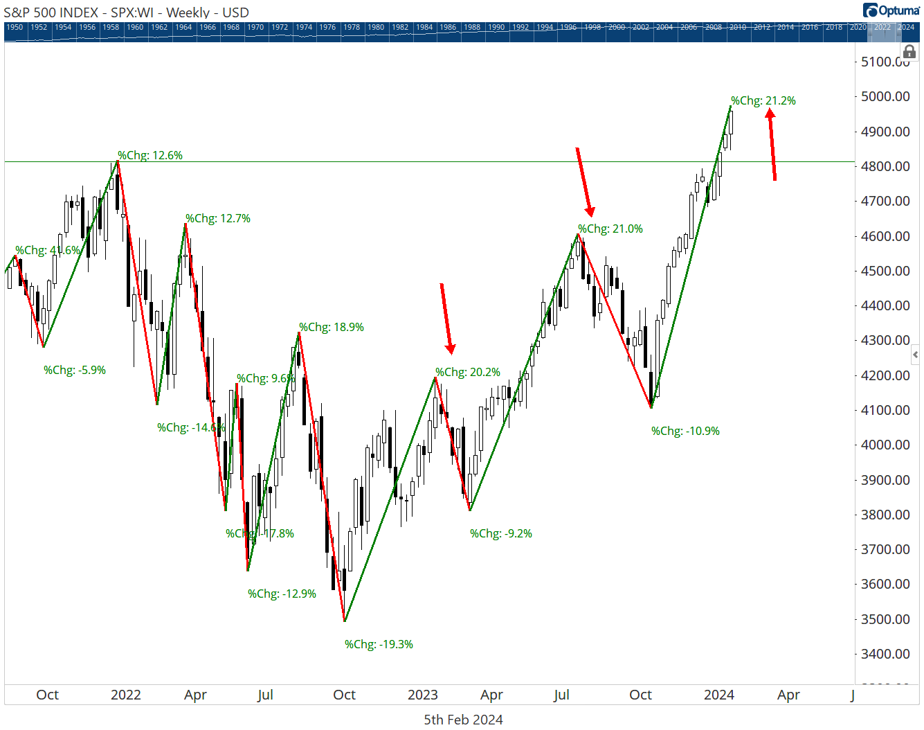
If you had not already heard it in the news, the SPX is back in All Time High territory as of last week when it passed the Jan 4, 2022 high. It’s interesting that this is also the third 20% increase in a row with the first starting in October 2022. Back then, central banks were increasing rates and there was concern all over the world about inflation. The higher interest rates often mean that there are better returns to be had in Bonds rather than Stocks and that is one of the reasons that we see Stocks fall as money if shifted to Bonds. But despite all of the economic woe, the S&P 500 has shaken off the gloom and powered on ahead. Will it continue? No one can say for sure, but until there are signs of a significant reversal, US Large Cap still looks like a good place to be. |
|
|
Mathew Verdouw, CMT, CFTe is an Australian Computer Systems Engineer who fell in love with the Markets and the journey to discover why they behave the way they do. He divides his time between learning about the markets, working with clients who include some of the largest funds in the world, and creating software to help his clients gain better access to Technical and Quantitative tools. |
|
| You are receiving this newsletter because you subscribed to the Chart Advisor newsletter. If you wish to unsubscribe, please click here. Dotdash Meredith 225 Liberty St, 4th Floor, New York, NY 10281
© 2024 All Rights Reserved. Privacy Policy | Terms of Service |
|
|
|