1/ Electric Cars Are Our Future |
2/ Argentina – It’s Time? |
4/ S&P 500 – What’s the Breadth? |
|
|
Investopedia is partnering with CMT Association on this newsletter. The contents of this newsletter are for informational and educational purposes only, however, and do not constitute investing advice. The guest authors, which may sell research to investors, and may trade or hold positions in securities mentioned herein do not represent the views of CMT Association or Investopedia. Please consult a financial advisor for investment recommendations and services. |
|
|
Electric Cars Are Our Future |
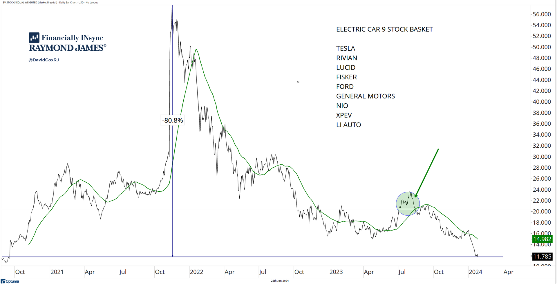
Although governments around the world are mandating (aka forcing) everyone to plan to buy electric cars, investors aren’t excited right now. A cursory read of the headlines (fundamentals) tells me that consumers aren’t buying the inventory and it’s been a cost hole for many manufacturers, especially big ones like Ford and General Motors. Here’s an equal weighted composite of nine stocks and it’s currently -80.8% below the 2021 highs and in a clear downtrend. Last summer, the group tried to move higher (green circle), but that move has since failed. Charts are charts, whether you like your electric car or not (or plan to get one), be careful and accept that great ideas don’t necessarily mean great investments. |
|
|
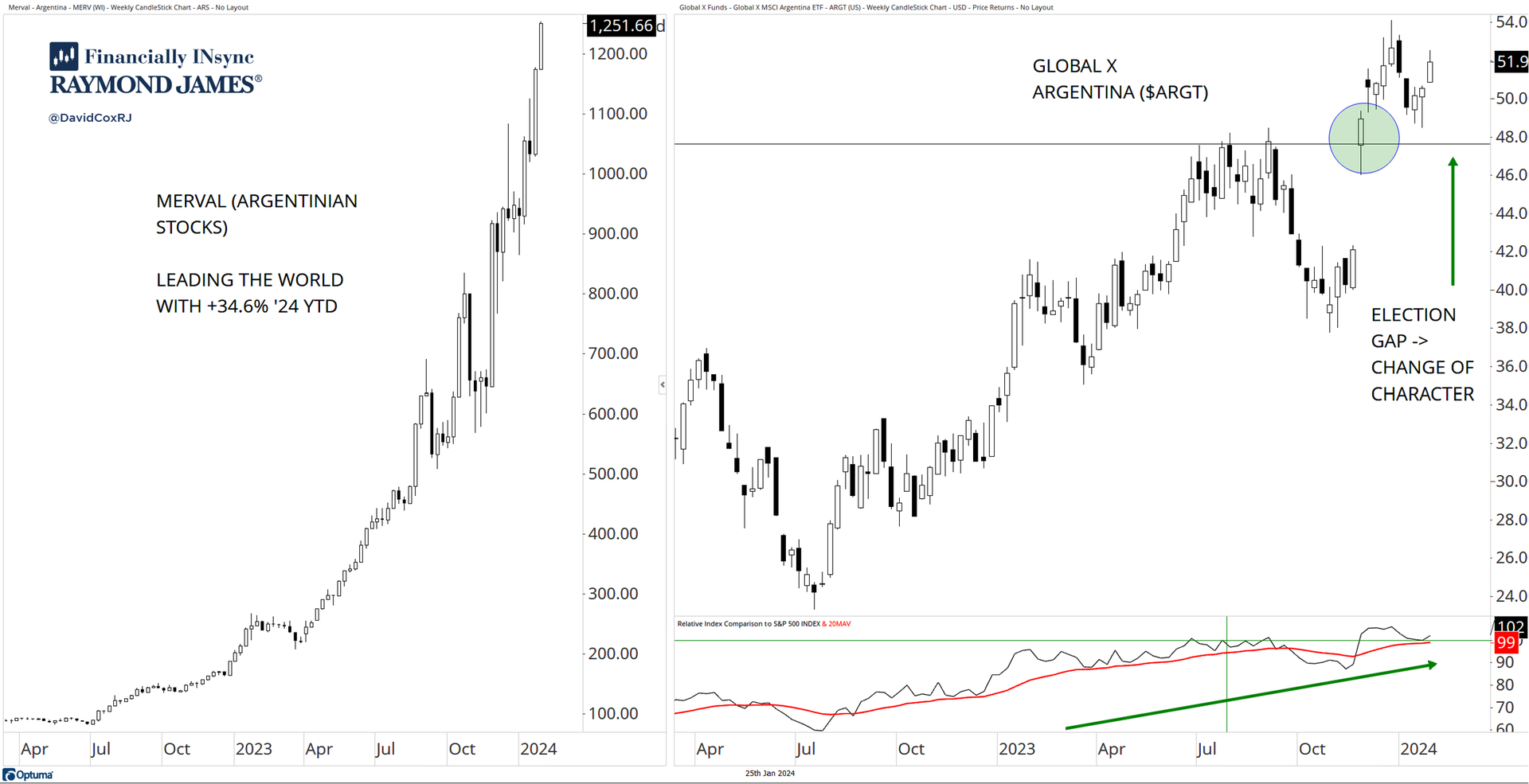
The Argentinian stock market has been soaring for years (+it’s 34.6% already YTD in ’24). An excellent example of the inflationary characteristics of stocks with the only way to combat soaring triple digit inflation is to own assets like stocks, although stocks aren’t on the balance sheets of many Argentinians (I suspect). This of course is the issue, whereby inflation, money printing and reckless government spending harm the low-middle class who is priced out of their life, while the wealthy benefit through asset price inflation (hint: this is happening in the U.S. and Canada too). Since the recent electoral change, currency and central bank plans are being changed and the Global X Argentina ($ARGT), the ETF available to U.S. investors, is sporting a different look. Certainly not the smooth and soaring ride that the local Merval stock market has been (left panel), but a post-election gap up and S&P 500 relative outperformance for the past year for $ARGT tells me we shouldn’t just scoff at what is happening. |
|
|
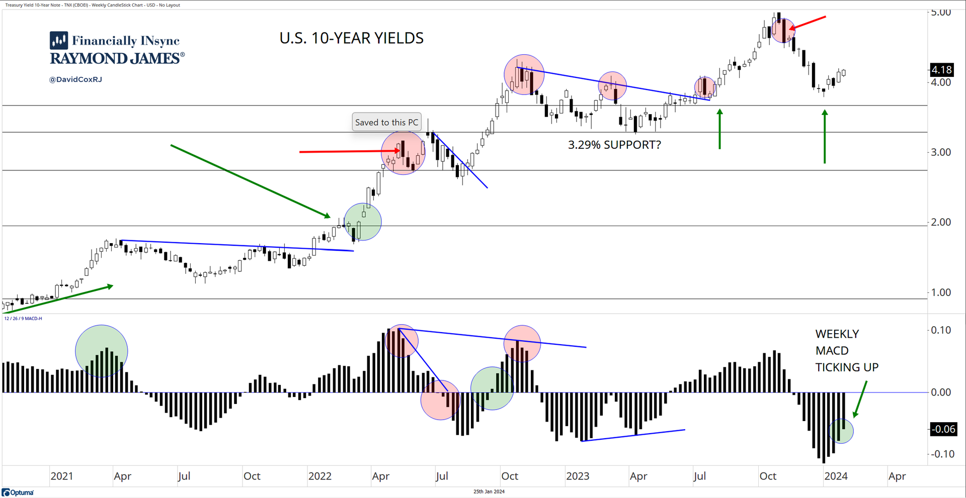
Analysts and economists failed to forecast the significant rise in yields and yet now, we hear them tell us that rates are going to come back down and they’re certain. Here’s the chart of U.S. 10-year U.S. yields. It looks like consolidation to me after a strong rally. I like to use the Moving Average Convergence Divergence (MACD) histogram to point in the direction to lean from an investment and expectation standpoint. What does the histogram show? Most investors (that are familiar with the MACD) would use the signal line itself as the tool, but the difference between the two MACD lines can be viewed in histogram form (as below), and essentially provide a means of gauging if the short-term trend is moving faster or slower than the longer-term trend. The weekly histogram has been ticking upwards for several weeks now, and continues to do so. This helps me gauge and set my own expectations and certainly means piling into bonds is not on our current action list (since yields are inversely related to bond prices). |
|
|
S&P 500 – What’s the Breadth? |
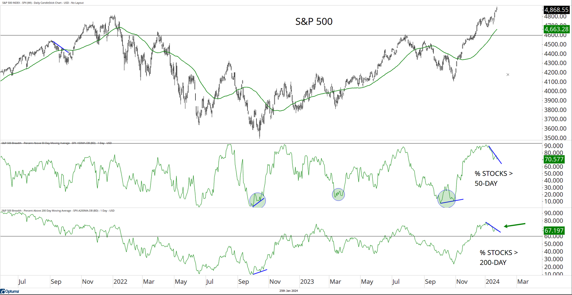
I think we can get far more information than we can by looking at a price index, if we seek to understand how many stocks are participating in the strength (or weakness) of a price move. It’s called market breadth. The S&P 500 contains 500 companies, and we can see in the chart below that 70.6% of those stocks are above a 50-day moving average and 67.2% of them are above a 200-day moving average. A lot of technicians would say that approximately 60% is a useful line in the sand demarking health of a market. What I’m pointing out here in the short-term, is that we’re seeing some bearish divergence, meaning fewer stocks are above those moving averages (starting to fall) while the market is going up anyways. It’s not a big-picture problem (at all), but it’s simply telling us that the stock market is extended. I know full well that many investors are (always!) unwilling to buy the dips, and the pullbacks, and instead find themselves chasing extended markets, and then see some weakness set in shortly afterwards. You don’t get to be surprised if profit-taking arrives in the near-term. |
|
|
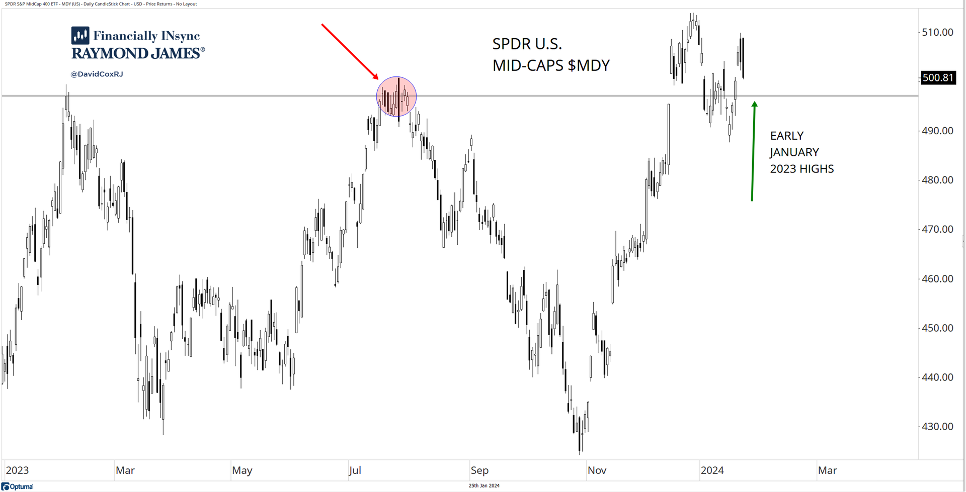
The stock market since the late ’22 lows has been a large-cap story, but here again, we are seeing the potential of more stocks considering participating in the bull market. The SPDR S&P Midcap ETF ($MDY) is currently sitting above the early and mid’23 high points (resistance), which one could now call support (horizontal line). Having gapped up above that line, fallen below again (a failed breakout) and then recovering so quickly, is constructive price action. Let’s watch carefully to see if mid-caps can now exceed those recent highs and print some higher highs and with it, perhaps some relative outperformance vs. large-caps. But let’s not get ahead of ourselves. This has been a weak area of the market, and it needs to prove itself before it really deserves our attention (or at least capital), especially at the index level. |
|
|
A Word from this Week's Authors |
I hope you’ve managed to gain some insights, and perhaps take away some ideas this week about how to use charts to gauge expectations and ultimately drive investment decision-making. I can be found posting charts almost every day on Twitter (I mean “X”), so please follow me @DavidCoxRJ if you want to see what I’m seeing. You can also email me: david.cox@raymondjames.ca to sign up for my distribution list, to receive our “Monthly INsync Chit Chat” and a weekly Friday webinar called “Where Do We (Investors) Stand?”. There is no cost or obligation. Investing isn’t easy and we all have to keep learning (me too!)! Don’t ever be fooled by someone who says they have it all figured out and their black box is the secret to huge returns without risk. |
|
|
About This Week's Authors |
David Cox, CMT, CFA, FCSI, FMA is a dual holder of both the Chartered Market Technician (CMT) and the Chartered Financial Analyst (CFA) designations and is a Senior Portfolio Manager at “Financially Insync” at Raymond James Ltd., in Waterloo, Canada. He manages assets for Canadian, U.S. and International clients using a fundamentally screened, yet technically driven process and produces a weekly webinar called “Where Do We (Investors) Stand?” each Friday. You can find him on “X” at @DavidCoxRJ as he openly and candidly shares charts and perspectives without bias. |
Conor White, CMT, CIM started his career in wealth management in August of 2017. He holds both the Chartered Market Technician (CMT) and Chartered Investment Manager (CIM) designations. He graduated from Wilfrid Laurier University's Honours Bachelor of Business Administration (BBA) program in 2015 with a concentration in Finance and Economics. Trade analytics, attribution, security screening, order execution, and technical market research are among his many responsibilities as part of the Financially INsync team. Born and raised in Guelph, his interests include music, travel, art and technology. |
|
|
You are receiving this newsletter because you subscribed to the Chart Advisor newsletter. If you wish to unsubscribe, please click here. Dotdash Meredith 225 Liberty St, 4th Floor, New York, NY 10281
© 2024 All Rights Reserved. Privacy Policy | Terms of Service |
|
|
|