Investopedia is partnering with CMT Association on this newsletter. The contents of this newsletter are for informational and educational purposes only, however, and do not constitute investing advice. The guest authors, which may sell research to investors, and may trade or hold positions in securities mentioned herein do not represent the views of CMT Association or Investopedia. Please consult a financial advisor for investment recommendations and services. |
|
|
Source: StayVigilant.Substack.com, Bloomberg |
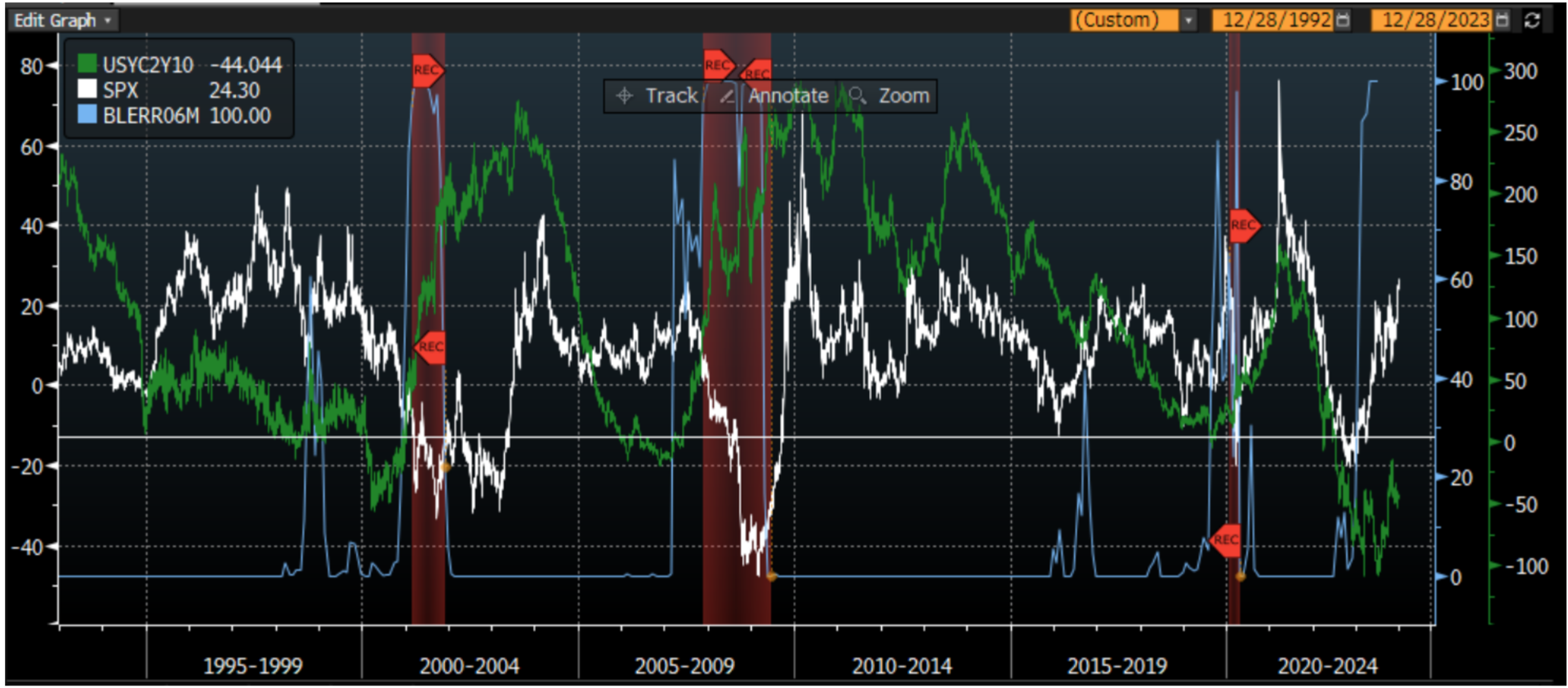
One of the core tenets of technical analysis that is taught by the CMT Association but that is often overlooked by many who are beginning their technical journey is intermarket analysis. We too often want to look solely at a price chart of an individual security and make our decisions. However, there is a robust well of information that exists either in economic data we may only analyze in the moment, or in asset classes that we tend to not pay attention to. As I have been fortunate in my career to work in equities, foreign exchange, commodities and fixed income, I understand the depth of information other asset markets can bring to the equation. My approach at Stay Vigilant is to demystify the world of finance for the average investor. I call it demystifinance. I try to show how an institutional investor may consider fundamental, technical and catalyst information to make an informed decision. My hope is that you can as well. A major part of my work is intermarket and intertemporal analysis. This is what I will dig into this week. The first chart today considers the yield curve. Many have heard that the yield curve predicts recessions. This is correct as the yield curve has a perfect hit rate. However, a big problem is that it has long and variable lags i.e. a recession could occur anywhere from 3 months to 2 years after it inverts. This may be why many were too negative in 2023. There is a logic as to why it should work as an inverted yield curve makes it less appealing for banks to lend money, which eventually slows the economy. This first chart looks at three things - the 2-year vs. 10-year part of the yield curve with a horizontal line drawn at 0 to show where it inverts, the Bloomberg consensus economist odds of a recession in 6 months, and the yearly returns of the SPX. We can see three things: - A recession (red-shaded area) does occur after the curve goes below 0.
- The consensus economists only get this pessimistic right before a recession.
- SPX yearly returns are always negative once a recession happens.
While none of this may be immediately actionable, it is an important backdrop to keep in our heads. |
|
|
Financial market research from professionals at the forefront of technical analysis innovation. |
|
|
Source: StayVigilant.Substack.com, Bloomberg |
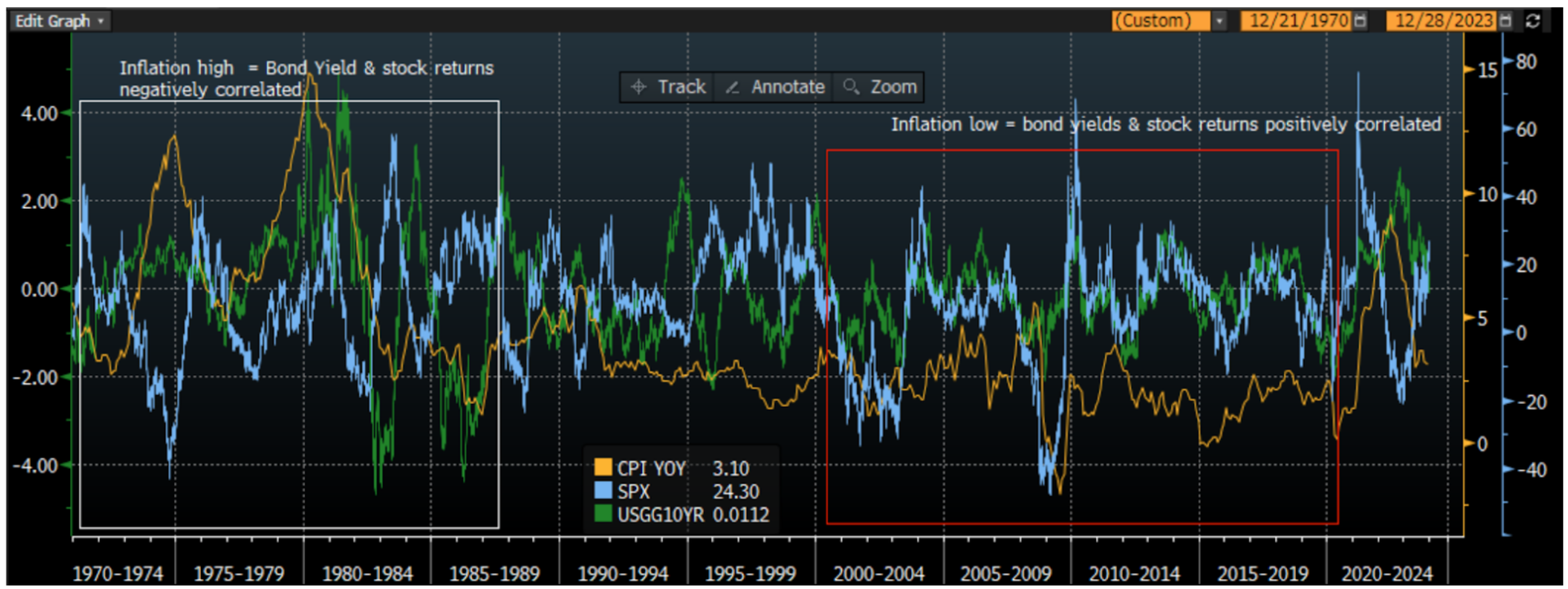
The most fundamental decision for investors, particularly at the start of the year, is whether (and how much) to allocate to stocks or to bonds. There are many approaches an advisor may take in helping a client reach this decision, but the fundamental premise is that the stability of fixed income can provide ballast to a sometimes volatile equity portfolio. As such, concepts such as the 60-40 portfolio for individual investors or risk parity for institutional investors have become quite common. The second chart today looks at the correlation of stocks and bonds. For bonds, I use bond yields because I can get a longer time series of information. Remember, when bond yields go higher, bond prices go lower and vice versa. I look at the relative performance of stocks and bonds and compare it to inflation as measured by CPI. Inflation, after all, may have been THE story of 2023. This chart shows that inflation is critical to the correlation of performance between stocks and bonds. On the right side of the chart, in the red box, I show that when inflation is low, stock returns and bond yields are positively correlated. This means stocks and bonds are negatively correlated. This is because the only concern is then growth, which means when stocks go higher on positive growth outlooks, bond yields (prices) go higher (lower) on expected higher rates. When stocks go lower on negative growth outlooks, bond yields go lower on expected Federal Reserve rate cuts. In both cases, stock prices and bond prices move in opposite directions meaning one hedges the other and provides a balanced portfolio. However, on the left side of the chart, in the white box, we can see that in periods of high inflation/CPI, the opposite is true. Stock returns and bond yields are negatively correlated which means stock prices and bond prices are positively correlated. This is because the market is focused on inflation - higher inflation means higher yields expected and lower stock prices as inflation hurts margins. In these periods, the portfolio that consists of both stocks and bonds is not hedged as both assets move in the same direction. This is exactly what we saw on the negative side in 2022 and is what we have seen on the positive side in Q4 of 2023. The question then remains for the investor: what is your view of inflation in 2024? Inflation will impact the move of stocks and bonds relative to one another. |
|
|
Source: StayVigilant.Substack.com, Bloomberg |
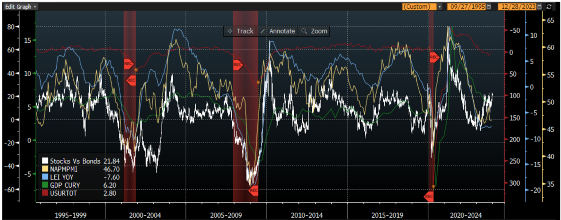
Sticking with the stocks vs. bonds relative performance, I create an indicator from the ratio of the total return of the SPX Index and the US Treasury bond index. I compare this relative performance to economic indicators that get tracked and discussed in the market. After all, the economy leads earnings and earnings lead stocks. If the economy is doing well, all else equal, stocks should do well. If it is not doing well, stocks may struggle. We saw in the first chart that both the yield curve and the consensus economists suggest there could be struggles in the economy sometime in the next 6 months. What about other indicators that may be more timely than these? The first two you should consider in this chart are the US ISM Index (NAPM PMI) and the Leading Economic Indicators (LEI). Both of these are coincident with the stock market, which itself is a leading indicator. You can see that both of these headed lower for much of 2023 but have flat-lined a bit of late. As these stopped going lower, the relative performance of stocks vs. bonds has shot higher, perhaps much more than the economic indicators may suggest if history is a guide. Two other economic data points I add on this chart are GDP (green) and the US unemployment rate (inverted in purple). I add these on the chart in order to show you that both of these data points lag the relative performance of stocks and bonds quite badly. While many in the news like to discuss these data points extensively, both are lagging as to the point of being almost useless for most market practitioners. |
|
|
Source: StayVigilant.Substack.com, Bloomberg |
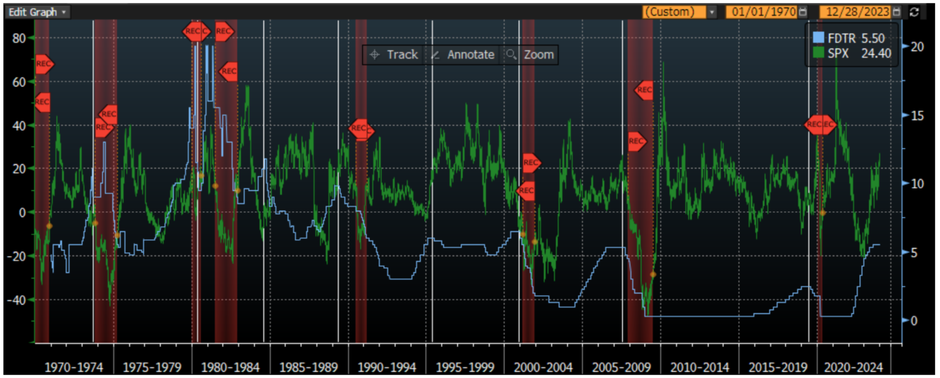
The final chart I want to show is the yearly performance of the SPX compared to when the FOMC cuts its discount rates. After all, if the economy has risk to it as some of the other charts suggest, that should mean the FOMC will cut rates. This should be good for stocks, right? The market has been pricing in 6 rate cuts throughout 2024 even though the market broadly speaking is expecting a soft landing and not a recession. A soft landing is when the growth slows down but people don’t lose their jobs. I look at 50 years of Federal Reserve Discount Rate and SPX yearly return data. I have drawn vertical white lines when the FOMC is cutting rates. The red-shaded area indicates when there is a recession. What you can see is that the FOMC has cut rates 8 times in these 50 years and there has been a recession 6 of these times. The other 2 times were what we would call a soft landing. We can also see that if in fact we get a soft landing, the SPX yearly returns are positive. If we get a recession, the SPX returns are always negative. This would suggest the market returns right now are suggesting a soft landing with FOMC rate cuts forecast to occur. One finer point, however, the keen eye may see that the SPX yearly returns were negative in the period leading up to the rate cuts ahead of a soft landing. Thus, the market seems to have been responding more to no recession than actual rate cuts. Tomorrow, we will try to get a sense of what the odds of this soft landing may look like. |
|
|
Rich Excell, CFA, CMT is a 30-year hedge fund and proprietary trading veteran who has lived and worked in Asia and Europe in addition to the United States. He has run investment businesses spanning equities, fixed income, commodities and foreign exchange. Rich is now a Clinical Assistant Professor of Finance at the Gies College of Business, University of Illinois, Urbana-Champaign. He also is the host of the Investment Exchange Forum and Macro Matters podcasts for the CFA Society Chicago and writes a bi-weekly options trading blog ‘Excell with Options’ for the CME Group. Finally, he writes a weekly Substack blog called ‘Stay Vigilant’ which aims to demystifinance for the average investor. |
|
|
You are receiving this newsletter because you subscribed to the Chart Advisor newsletter. If you wish to unsubscribe, please click here. Dotdash Meredith 225 Liberty St, 4th Floor, New York, NY 10281
© 2024 All Rights Reserved. Privacy Policy | Terms of Service |
|
|
|