|
 |



Before we dive in…
💼 I am considering a move in-house and am currently seeking job opportunities. There are a lot of you here, and someone may know of something that I would be a great fit for, so I’m asking for your help. I’m very open to different industries, and am primarily focused on finding challenging projects that I can work on with smart people. I’m particularly interested in product management or product marketing, growth strategy roles, or editorial/comms. Are you or someone you know seeking a wordy ex-founder with tons of varied experience, excellent follow-through, and big opinions? Let me know! You can see my professional self on LinkedIn here. Thanks!
💬 Are you a paying subscriber to Think Piece? It’s time to submit a question for Brain Trust! You can ask me anything: tactical, practical, philosophical, topical…this is your opportunity to get a custom essay on the problem or topic you are most interested in. Not a paying subscriber yet? Upgrade to submit!
My eyes are crossed. I have no idea where to look. I feel like I’m in a simulator game, like I’m a little kid again on Star Tours at Disney World and my dad looks like he’s going to vomit and I’m not sure if I’m going to make it out of the ride alive.
But I’m not on a ride. I’m on a website from a major player in the payments space, a page that is supposed to be announcing a major update that is supposed to “shock the world,” but despite trying to look at the page multiple times I have no idea what the announcement is because I’m dizzy and confused and don’t know what is happening.
Why are all the web pages moving?
Web Design Is Failing
PayPal is a loser, this is known. The company continues to have marketshare because of intrenchment, not innovation. The experience for a business is terrible. But with the immense resources at their disposal, why is this the best they can come up with to announce their so-called shocking product update?
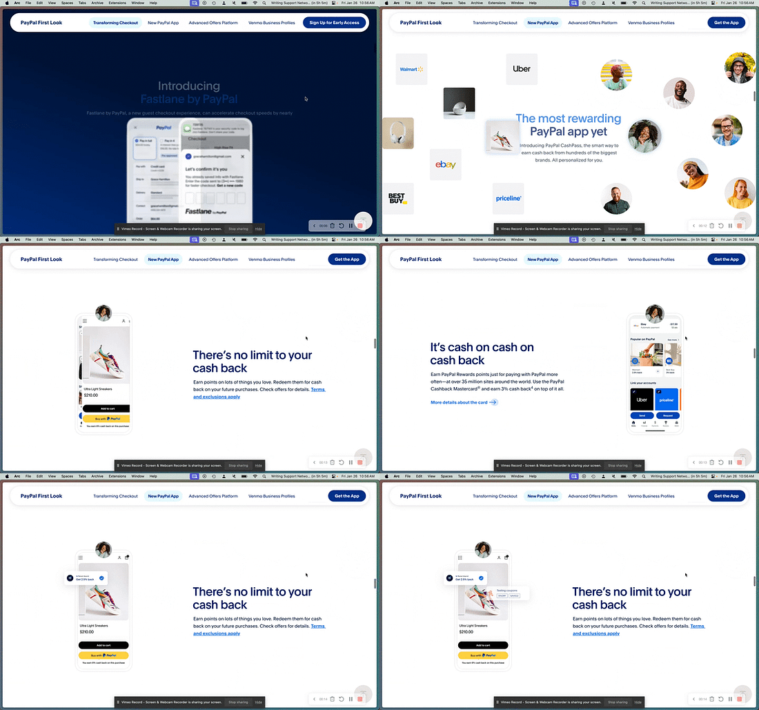 |
Each scroll moves something or multiple things on the page. It’s so fast that you can barely read. Maybe you’re supposed to do one scroll and then stop, letting the animations play? Who uses a website like that?! The copy is confusing as well, and there are no clear markers between sections which, coupled with the motion speed, means you can barely tell that this page is talking about multiple new features. There is a lot of noise, but no signal to be found.
Web design has been heading in a direction where it’s conflating complexity with creativity, and designers seem to believe that, in the face of decreasing attention spans, the only way to capture eyeballs is through insane levels of motion. The theory appears to be that page visitors need overstimulation in order to focus. Unfortunately, as many neurodivergent people can tell you, overstimulation is not effective for comprehension or retention of information.¹ My time on page may have been high, but only because I was trying to figure out what was going on.²
It’s not just the PayPals of the world who are trying to innovate in this way. A new-to-me productivity and calendar software, Amie, did a public launch this week with a website that recreates the worst of Star Tours. The software itself I like! I’ve downloaded it, and have replaced fka Cron/currently Notion Calendar with it for now. The software has very little in the way of animations. It’s clean, and fairly intuitive.
But the website…every scroll makes me more confused. I can’t figure out where to stop. The scroll does not “snap” the webpage into place, stopping it at the crucial point. I have no idea what information is being communicated because it all moves so quickly that I cannot absorb it. I think it’s trying to show me the functionality? But it moves so fast with every scroll that I can’t see it? But there’s also nothing on each scroll to suggest I should stop scrolling?
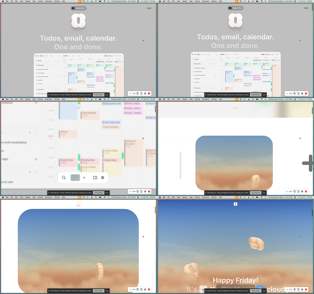 |
And even worse, you have to scroll to the bottom to do anything other than login, meaning you get to go through the nauseating process over and over again if you revisit the page.
This is actually all Apple’s fault. The company has often used this pseudo-interactive scrolling motion web design on their product landing pages, often with success. However, the first half of their newest product page for the (extremely dumb) Vision Pro headset has some of the same issues as PayPal and Amie: the scrolls don’t snap into place, there is no indicator of where to stop scrolling, information is lost in motion, and it’s dizzying. However, Apple’s experience with this kind of web design does show: the font is legible (though the headers move too fast with the scroll), the moving parts are greyed out and pushed to the background, each section has a clear piece of information (the copy is so much better than PayPal someone there needs to find a new job sorry), and on the second half of the page when we get clear delineations between sections which greatly increases readability. Apple is the mold, and while the VR headset page is not completely successful, it does manage to convey information more effectively than the other examples.
UX/UI is a thing for a reason: people engage with websites in predictable ways based on prior experiences, and when you want to challenge that engagement style, when you want to innovate and break the mold, if you do it too much, the information and purpose of the thing will be lost.
All of this reminds me of my favorite Extremely Online thing in the past week:
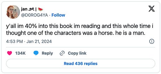
Dying to know what book this is. Dying to know what the writer thought, what the editor thought, what early readers thought. Yes, this is funny, and maybe this person does not have strong reading comprehension skills, but it points to the deeper truth: trying to be clever, or creative, or flashy without a check for legibility will leave your audience confused. Your audience does not have perfect information the way you do about your book, your product, your announcement. If you aren’t careful, they will think your website is a horse.
Ok You Can Have Some Motion
Some motion is useful! It can actually help to draw the eye somewhere specific, help to affirm the user’s expectation of an action, or even just to be fun. Motion does not have to be an overwrought experience in order to create interest and engagement.
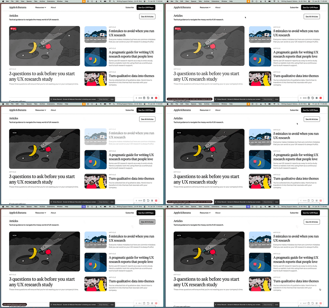
My friends at UXR training company Apple & Banana have a site that uses motion really well. When you hover over something that is clickable, it moves. This is a classic motion usage, and it serves to affirm the action you can take: movement = click. This is the same theory as hovering over a link or button and having it change colors. The change lets you know that you can interact. The language is clear: motion means clickable.
 |
.
Of course, even this can go too far. Squarespace at some point added the motion of every damn thing as standard. Every header, paragraph, and object swoops in like the fancy WordArt transition animations I grew up making in PowerPoint. I’ve worked with countless clients on Squarespace sales pages, and my constant feedback is to remove the motion. When everything moves, when every header or paragraph or image is worthy of special attention, then nothing is special.
And it gives me a headache.
To some extent, this is a matter of taste. Some of you may like the VR-style scroll, and I concede that some scroll snap movement can be pretty slick. But, as someone who is always focused on conversion if working on a business website, this is my plea: think about the why behind the movement. Does it mean something? Does it distract from meaning?
Ultimately, legibility is more important than looking cool for a business. Vibes only get you so far. If no one can understand your message, they will not give you money.
Stimulation and overstimulation are not the same thing. Some brains benefit from extra stimulation to help with focus, but go too far and they explode or shut down.
Apparently not much, since PayPal’s stock fell 4% after this announcement because the “shock” factor on these updates was pretty low.
You’re currently a free subscriber to Think Piece. For the full experience and to ensure the longevity of this work, upgrade your subscription.
| ||||||||||